Saturday 31 December 2016

Every Road Tells a Story

If you’re like me the ending of one year and the beginning of another is a special time of transition. We have the opportunity to leave the past behind and move forward in new directions to discover what the future holds for us. Every life – like every road – tells a story.

every road tells a story 1

NIKON 1 J5 + 6.7-13mm f/3.5-5.6 @ 9.8mm, ISO 400, 1/640, f/8.0

For many of us the future looks lush and green – full of promise, with only the faintest hint of difficulty ahead. We journey forth with unbridled confidence and optimism, looking forward to the dawn of each new day. The very idea of not meeting our objectives seems completely foreign…an impossibility.

every road tells a story 2

NIKON 1 J5 + 10-100mm f/4-5.6 @ 10mm, ISO 800, 1/1000, f/7.1

There are other times when the road looks perilous. Where it leads is unknown and we often wonder if the day-to-day efforts that we are expending are really worth it as no apparent reward is in sight. These times test the essence of what we are made, and how dedicated we are to our goals in life.

every road tells a story 3

NIKON 1 J5 + 10-100mm f/4-5.6 @ 10.9mm, ISO 160, 1/320, f/8.0

Every one of us has had times in our lives when we have needed to navigate around obstacles while still pursuing our hopes and dreams. We maintain our sense of purpose and energy. If the twists and turns we are going through seem manageable and worthwhile we persevere. Our destination is etched in our mind, keeping us on our path no matter the number of turns we may encounter.

every road tells a story 4

NIKON 1 J5 + 10-100mm f/4-5.6 @ 17.1mm, ISO 160, 1/500, f/5.6

Our life’s purpose may be grand or small, but deep inside our individual cores we know it is what causes us to get up in the morning to face each day whatever it may bring. The amount of time that each of us has left to pursue our purpose can never be known. For all of us tomorrow is but a promissory note we hope to be able to live.

every road tells a story 5

NIKON 1 J5 + 10-100mm f/4-5.6 @ 10mm, ISO 400, 1/125, f/5.6

Some roads – like some lives – require innovation and effort to overcome factors that are simply impassable if we stayed on our current path. How many times have each of us gone through the process of reinventing ourselves? The number of times, and the efforts it took to do so, matter not. All that really matters is what we learned through these experiences and how they helped us be more purposeful, understanding, and empathetic as we go through life.

every road tells a story 6

NIKON 1 J5 + 10-100mm f/4-5.6 @ 10mm, ISO 160, 1/640, f/5.6

Each of us in our own, unique way has the power to accelerate our journey of self-discovery through the choices we make in life. We need the courage to continue to venture forth regardless of the obstacles and hardships we face. The naysayers we meet. The moments of self-doubt that we may suffer. To live up to our true potential is the gift we have to give to the world, and to those we love. May each of you unlock more of your potential in 2017, and make the world a better place because of it.

Article and all images are Copyright 2016 Thomas Stirr. All rights reserved. No use, adaptation or reproduction of any kind including electronic is allowed without written consent. Photography Life is the only approved user of this article and these Copyrighted images. If you see this article or images reproduced anywhere else it is an unauthorized and illegal use.

The post Every Road Tells a Story appeared first on Photography Life.


from Photography Life https://photographylife.com/every-road-tells-a-story

Thursday 29 December 2016

What Makes a Good Night Photography Lens?

Everywhere in the world, across the course of a year, the sun will be below the horizon just about 50% of the time. Although it can take a while for sunset to fade away completely, it’s safe to say that we spend a huge portion of our lives under dark skies. Normally, nighttime isn’t something that people equate with being awake, of course, but landscape photographers are strange people. In fact, moonlight and the Milky Way can lead to some of the best photos you’ll take, and they are well worth exploring with your camera. In this article, I’ll go through the characteristics that make some lenses better than others for star and nighttime landscape photography.

1) Criteria

More than almost any other type of equipment, a lens for nighttime landscape photography has to fulfill a wide range of difficult requirements. Here’s what the best of these lenses have:

  • A large aperture: At night, you’re fighting for every photon. A large aperture lets more light onto your camera sensor.
  • A wide focal length: As the Earth spins, the stars in your photo begin to blur across the sky. When you use a wide focal length, though, they don’t appear to move as much. So, with a wide angle lens, you can use longer shutter speeds and let more light onto your camera sensor. (If you are intentionally trying to capture star trails, though, a wider focal length isn’t necessary — in fact, you may prefer a longer focal length, since you’ll see blur more quickly.)
  • High sharpness: For night photography, pay special attention to the corners of an image, since you’ll be shooting at wide apertures, where most lenses are significantly less sharp.
  • Low coma: Some lenses cause bright pinpoints of light, like stars, to smear when they are at the corners of your frame. Good lenses have less coma.
  • Low vignetting: If the corners of your photo are excessively dark, you’ll need to brighten them in post-production, which adds a lot of noise/grain.

Typically, the most important features of a nighttime photography lens are its maximum aperture and widest focal length. Why do these matter so much? Simple: they affect the amount of light that reaches your camera sensor.

Night Photography Lenses

NIKON D800E + 14-24mm f/2.8 @ 14mm, ISO 3200, 25 seconds, f/2.8

2) The 500 Rule

Before we dive deeper, let’s cover something known as the 500 rule. This rule says that — in order to avoid blurry stars — the longest shutter speed you can use is equal to 500 divided by your focal length.

For example, if your focal length is 20mm, the 500 rule says that you can use a shutter speed of 500/20, or 25 seconds. Here’s a quick chart of the longest shutter speeds you can use at night for a given lens. (The numbers below are full-frame equivalents. If you have, for example, an 18mm lens on a 1.5x crop-sensor camera, you’ll need to look at 28mm on this chart):

  • 11mm: 45.5 seconds
  • 12mm: 41.7 seconds
  • 14mm: 35.7 seconds
  • 16mm: 31.3 seconds
  • 18mm: 27.8 seconds
  • 20mm: 25 seconds
  • 24mm: 20.8 seconds
  • 28mm: 17.9 seconds
  • 35mm: 14.3 seconds
  • 50mm: 10 seconds
  • 85mm: 5.9 seconds

The 500 rule used to be called the 600 rule, and now I’m starting to hear some people call it the 400 rule. The numbers keep changing because new cameras have more and more pixels, which means that they can detect smaller and smaller star movements. The chart above is a good guide, but you’ll want to test your own camera to confirm that there isn’t too much movement, particularly if you have a recent camera with an extremely high megapixel count (more than 36).

Night Photography Lenses

NIKON D800E + 14-24mm f/2.8 @ 20mm, ISO 3200, 25 seconds, f/2.8

3) Combining Aperture and Focal Length

Quick, which one is better for star photography — a 14mm f/2.8 lens, or a 24mm f/1.8 lens?

The 500 rule favors the 14mm, but the 24mm has a wider aperture. To calculate which one actually lets in more light, you’d need to see if the wide aperture of the 24mm offsets the longer exposure of the 14mm.

Things get even more complicated when you start using lenses on cameras with different sensor sizes. Which is better at night — a 7mm f/2.8 lens on a micro four-thirds camera, or a 24mm f/4 lens on a full-frame camera?

I’ve always found these questions time-consuming, so I made a chart that rates lenses for their nighttime photography potential. This chart has gone through many different versions, but I ultimately decided that the best way to arrange it is based upon the ISO that gives your photos an acceptable brightness at night. (Obviously, a lower ISO is better, since your final photo isn’t as noisy.)

For example, with a 20mm lens — a 25 second exposure by the 500 rule — at f/2.0 on a full-frame camera, what ISO do you need in order to capture a photo that is bright enough? ISO 2563 (rounded to ISO 2500, which your camera allows you to set), according to the chart below. I also bolded and underlined some popular lenses that people use for nighttime photography, so you can see how they compare to one another:

Nighttime ISO

Important note: As you might have been wondering, this “proper brightness” exposure will not actually be accurate in every case, depending upon the conditions that you encounter. At certain times of night, and under different moon conditions, I have used everything from ISO 200 to ISO 6400 successfully, even with the same aperture and shutter speed settings. The values above are calibrated for the brightest portions of the Milky Way under a clear, moonless night without light pollution, and a lens that doesn’t have any vignetting — pretty ideal conditions. In other words, this is a score that helps you compare lenses, and not necessarily a recommendation for your ISO setting in the field, unless you are shooting under ideal conditions.

A few other points to mention:

  • Obviously, round these values. Your camera doesn’t let you pick an ISO value of 2965, for example, so just round up to 3200.
  • This chart is designed for a full-frame camera, but you can still use it with a crop-sensor camera — just pay careful attention to the values you pick. On one hand, if you’re trying to figure out which ISO to use (which, as mentioned above, isn’t necessarily recommended), just multiply your lens’s focal length by the crop factor, and you’re good to go. For example, with the Olympus 8mm f/1.8 lens on a micro four-thirds camera (2x crop), the proper ISO is at the intersection of 16mm and f/1.8. Here, that’s ISO 1691, or ISO 1600.
  • However, if you are trying to compare the nighttime quality of lenses across sensor sizes, the process is different. Multiply both your focal length and your aperture by the crop factor to find your “full-frame equivalent” ISO performance. This lets you compare lenses across different sensor sizes to see which one is best for nighttime photography. In this case, the Olympus 8mm f/1.8 at ISO 1600 has the same nighttime photography “score” as a 16mm f/3.6 lens would on a full-frame camera. In this case, that’s ISO 6356.
    • Looking at this score, the Olympus 8mm f/1.8 would outperform a 16-35mm f/4 lens on a full-frame camera, since the 16-35mm f/4 “scores” an 8160. However, it would lose to a 16-35mm f/2.8 lens on a full-frame camera, which “scores” ISO 4080. Pretty easy!

(If anyone wants the formulas that I used to create the chart above, they’re messy, but I can take photos and add them to the comments section below. Essentially, all I did was look at a good exposure under ideal conditions — 20 seconds, f/2.0, ISO 3200 — and then calculate ISO values that give exactly the same brightness, just with different aperture and focal length (shutter speed) inputs.)

Night Photography Lenses

NIKON D800E + 20mm f/1.8 @ 20mm, ISO 3200, 15 seconds, f/2.0
This is close to the ideal exposure, but it was a bit too dark out-of-camera, and my lens has some vignetting. Ultimately, I had to brighten this photo slightly in post-production. Ideally, my settings here would have been 25 seconds, f/1.8, ISO 2000 (or ISO 2500). Although this photo still turned out fine, I could have used a lower ISO — and done less brightening in Lightroom — if I had exposed more carefully.

4) Depth of Field at Night

You wouldn’t know it from the charts above, but a 14-24mm f/2.8 lens is significantly better than a 50mm f/1.4 for nighttime photography. (According to the charts, the 50mm wins out, since it allows an ISO of 3200; the 14-24 requires an ISO of 3576.)

Why is the 14-24mm f/2.8 better? Simple: depth of field.

Wide angles have more depth of field than any other lens. A 14mm f/2.8 is almost perfect here — it can capture the entire landscape in focus, from 1.2 meters to the stars. By comparison, the 50mm f/1.4 only renders a sharp image from 30 meters on.

(Technical side note that you can skip: How did I get these numbers? It all boils down to this: every object in your photo has — at least — a slight blur to it, both from diffraction and from missed focus. Traditionally, when the size of that blur was larger than 30 micrometers on your camera sensor or film, it was said to be “out of focus.” I find that this definition isn’t good enough for today’s cameras, where a 30 micrometer blur can be very noticeable. However, for nighttime photography, you’ll have to relax your standards a bit. In this case, the old 30 micrometer definition actually works fine, so I was able to use an ordinary online depth of field calculator to find the values above.)

Even with an ultra-wide angle lens, though, you’ll still have problems getting everything in focus at night. Physics is simply working against you. If you’ve tried everything else, consider moving backwards as much as possible — place the foreground farther away from your lens. Of course, that isn’t always feasible, and, for the closest foregrounds, it still doesn’t help enough. Sometimes, I’ll even stop down slightly (and then raise my ISO) if it’s a particularly difficult landscape.

Ultimately, you may have no choice but to focus stack your images. Take a series of photos at different focusing distances, then combine them together in post-production. At night, though, this is very difficult and time-consuming, and I strongly recommend against it unless you have no other choice.

Night Photography Lenses

NIKON D800E + 14-24mm f/2.8 @ 14mm, ISO 3200, 25 seconds, f/2.8

5) Conclusion

Nighttime photography is one of the most demanding ways to use your equipment, and not all lenses are up to the task.

Along with the expected image quality difficulties (sharpness, vignetting, and coma), you have to find a way to work with as little light as possible to create your images. The only tools at your disposal — shutter speed and aperture — will be pushed to the breaking point.

The chart above gives you a good idea of the ISO you’ll need for your setup, but that isn’t the only that information that matters. You should also pay attention to depth of field; at night, there won’t be much.

Clearly, nighttime landscape photography is a tricky job. However, it’s also well worth the effort. The first time you bring back a good photo of the Milky Way or a starry sky, you’ll be hooked — I know I was. And, although the lenses you use certainly matter, they aren’t everything. The hardest part is just staying out at night in the first place. When you do, good images will follow.

The post What Makes a Good Night Photography Lens? appeared first on Photography Life.


from Photography Life https://photographylife.com/what-makes-a-good-night-photography-lens

How to Make Sharp Watermarks in Lightroom

One of the biggest frustrations with Lightroom’s built-in watermarking tool, is the fact that it often ends up making watermarks appear too soft / blurry, especially when extracting smaller JPEG images. This happens due to Lightroom’s rather poor implementation of watermarking on images. Not only does Lightroom seem to apply sharpening to images before adding a watermark, but also, the resizing algorithm used by the software appears to be pretty bad. No matter what image dimensions one chooses, Adobe has not provided a way to turn off scaling in Watermark Editor, even if one provides transparent PNG / GIF images with the correct dimensions. For this reason, many photographers end up using Photoshop for adding watermarks to images, which certainly does take more time and effort, but certainly delivers much sharper results in comparison. After seeing poor watermarking results, I decided to look into alternative methods to see if there is a way to make watermarks sharper using the same tools. After some experimentation, I came up with two methods that ended up working well and that’s what I am going to share with our readers in this article.

Take a look at the two images below – the “Before” image shows how poorly the watermark is added by Lightroom, whereas the “After” image shows how it can look if it is done right:

Please note that the methods discussed below are somewhat advanced and require specific software such as Adobe Photoshop (for the first method) and Illustrator (for the second method). For the second method, you will also need to download an open-source font generation software called FontForge.

Method #1 – Resizing Watermarks to Exact Dimensions

This method is probably the easiest one to implement, since you only need to use Photoshop to adjust your watermark. Basically, the idea is to adjust your transparent PNG or GIF image, so that it has exactly the same image dimensions as the output image. For example, if you have an export preset that exports images at 960 pixels wide, you will need to adjust your PNG / GIF image so that the image width is exactly 960 pixels. This way, Lightroom can be forced not to scale your watermark and it will appear as sharp as you make it from Photoshop.

Unfortunately, this method has a few serious drawbacks. First of all, you will need to create two sets of watermarks for each side of image if you want to be able to place watermarks in all four corners. Second, you will need to create watermarks for both horizontal and vertical images separately, or Lightroom will again revert back to scaling. And if you output in multiple resolutions, you will need to repeat the same process for the rest of them, which can quickly increase the number of watermark presets you have on your computer. The result is definitely worth the effort still in my opinion though, as your watermarks will look drastically better in terms of sharpness and quality compared to the poorly resized versions that Lightroom spits out by default.

Here is the full list of steps you need to run:

  1. Determine the desired image dimensions for both horizontal and vertical images. In this particular example, I will only run through horizontal images that I want to output at 960 pixel wide resolution.
  2. Open up your transparent logo in Adobe Photoshop. Make sure that the logo has a transparent background, as seen below:

    PL Transparent Logo White
    If your logo is white, it might be hard to see it due to the bright checkerboard pattern of the background. If that’s the case, you can easily change it by visiting “Edit->Preferences->Transparency & Gamut” and setting “Grid Colors” to “Dark”:

    Photoshop Transparency and Gamut
    Now it should be much easier to see the logo:

    PL Transparent Logo White Dark Background
    Note that we have not changed anything on the image itself – we simply made the transparent background appear darker. If your logo is dark, you can choose the lighter transparent background / checkerboard.

  3. Now determine how big the logo should be when exported at your desired image dimensions – that’s what we need to resize the logo to. For the image size example of 960 pixels wide that I am using, I will be resizing the logo to 100 pixels wide, basically around 10% of the total width of the image. Go ahead and press CTRL+ALT+I (CMD+ALT+I on Mac) on the keyboard and type the target size:

    Photoshop Image Size
    For the “Resample” algorithm, choose Bicubic Sharper, since we are reducing the image dimensions and want to keep it sharp while resizing.

  4. The next step is to fill up the resized logo with extra space to cover the lost dimensions. Press CTRL+ALT+C (CMD+ALT+C on Mac) to bring up the Canvas Size tool:

    Photoshop Canvas Size

    Put the desired image dimension under width (in this case it is 960 for me) and leave the height value the same – that one does not matter. Make sure to move the Anchor to the right, so that the watermark is moved to the right side of the canvas. Once you click OK, you should see something like this:

    Logo in Canvas

  5. The watermark image is ready, but there is one small step I recommend you take. If there is not enough space to the right side of the image, it is best that you leave a little bit there to avoid using the horizontal inset in Lightroom. Unfortunately, Lightroom will again down-size your logo if you use the Horizontal inset, so it is best to leave a little bit of empty space to the right of your logo. You can simply drag the logo to the left a little, or for consistency, I always prefer using the keyboard left button instead. Make sure to press the “V” key to switch to move tool, then after selecting the corresponding layer that hosts the watermark, simply press the left arrow on your keyboard to start moving the logo away from the right edge of the frame. I moved mine about 10 times, which is 10 pixels from the edge of the frame.
  6. Save it as a PNG file again by pressing CTRL+SHIFT+ALT+S / CMD+SHIFT+ALT+S (Save for Web) and choosing PNG-24 as file format. Make sure “Transparency” is checked:

    Photoshop Save for Web

    Give it a meaningful name like “960px Horizontal-Right.PNG”

  7. Repeat the above step, but this time put the Anchor to the left side when resizing the canvas. This one will be used for the left side, so save it just like above with a name like “960px Horzontal-Left.PNG”
  8. Now that you have both files for the horizontal images, let’s go ahead and create the necessary templates in Lightroom. Fire up the Watermark Editor by going to “Edit->Edit Watermarks…”:

    Lightroom Watermark Editor Graphic

    Choose “Graphic” and pick the first file that we have just created. In my case, I used the “960px Horizontal-Right.PNG” image. Scroll down to “Watermark Effects” and make sure to select “Fit”. This way, nothing will get up-sized or down-sized, since the horizontal dimensions of the watermark match the dimensions of the image. Under “Inset”, do not touch the Horizontal value, but feel free to change the Vertical value, since you probably want to move it up or down a little depending on where on the right side you are placing the watermark.

  9. Save the Template with a meaningful name such as “960px Horizontal Bottom-Right”:

    960px Horizontal Bottom-Right

  10. Repeat the last twp steps above for the top of the image, then repeat it for the two left sides and give all three appropriate template names.
  11. You are all set! From here, all you have to do is export horizontal images and pick the right template to specify exactly where your logo is going to be.
  12. If you are planning to extract vertical images, repeat all of the steps above for the vertical images as well and name templates like “960px Vertical Bottom-Right”.

Here is the final result, with a crisp watermark applied to the exported image:

Watermark looks sharp after using one of the methods

Without a doubt, the above process is much more complicated than it should be. Adobe’s software design team should really get a slap on their hands for not making it possible to choose a watermark with exact dimensions and not scaling it in any way. There should be a way to add a simple option called “No Scale” under “Watermark Effects”, which allows the end user to choose a watermark and apply it to any side of the image, making “Inset” work by simply shifting the watermark by pixels either horizontally or vertically. It would save so many steps for sure!

Method #2 – Creating a Logo Font

The second method, which is a bit more complicated as it involves the process of creating a font and then installing it into your computer, is a much better approach compared to the first one, because you do not have to deal with different image sizes and dimensions – you could literally just have 4 templates in your Lightroom to make watermarks, irrespective of the image dimensions. The initial process is somewhat painful, but if you are ready to commit some time, you will be very happy with the results.

The only issue with this method, is that you cannot have different colors in your watermarks, since fonts can only be of one particular color! In my case, it is not an issue, but if you have different colors and tones that you want to preserve, your only bet is to use the first method.

Basically, the idea is to create a true-type font with your logo placed in one of the characters (like “A”, for example). Once the font is created and installed on your computer, you no longer have to use a Graphic watermark style. You can use “Text” and simply type the character that holds your watermark. Since fonts are vector-based, increasing or decreasing font size will not result in up-sizing or down-sizing of images, preserving sharpness in watermarks every time you use them.

Let’s get started:

  1. First, if you do not already have an SVG-formatted file containing your logo, make sure to convert it from your .AI or .PNG format logo file using Adobe Illustrator. Fire up Illustrator, then open up your logo. If you already have your logo in Illustrator vector file (.ai extension), all you need to do is save your file in SVG format. If you only have a transparent .PNG file, you will need to open it first, then run Image Trace in order to convert the logo to vectors that you can later export. Go to “Window->Image Trace” to bring up the Image Trace panel:

    Illustrator Image Trace
    Select “High Fidelity Photo” for the best quality vector conversion, then uncheck “Preview” and click “Trace” to start the process.

  2. After tracing is done, you will be able to view the tracing results from the top drop-down panel. Take a look at “Outlines” and make sure that your logo edges look good. If you are happy with the result, click the “Expand” button to convert the tracing object into paths.
  3. Now your logo is converted to vector paths! If you select the Direct Selection Tool (A), you will be able to select the different vector paths, as shown below:

    Illustrator Converted Vectors
    As you can see, I was able to select the “.com” part of the logo – those blue dots indicate different vector paths.

  4. The last step in Illustrator is to get rid of the potential borders of the image that got added as a result of the image trace. Simply click on the blue edges as shown below, then press the “Delete” key to get rid of them:

    Illustrator Delete Outer Borders
    Also, go through any of the areas that need to be removed for transparency – if you have letters such as “o”, you will need to clean those middle areas up, so that the vector paths only cover the actual edges of the letters and not their insides.

  5. From here, all we need to do is save the image to SVG format. Go to “File->Save As”, then click the drop-down menu where it says “Save as type” and pick SVG (*.SVG). Give your file a name like “Logo.SVG” and click “Save”. A window will pop-up that looks like this:

    SVG Save Options
    Just choose the defaults and click OK. The vector file is ready to be imported into a font creation tool. You can now close out of Adobe Illustrator.

  6. Download and install the open source font creation tool called FontForge from here. Fire up the software, then when the first window comes up, click the “New” button on the bottom to create a new font:

    FontForge New
    You will see a new window that looks like this:

    FontForge Main Screen

    If you have never used FontForge before, the software can look a bit complex to use. However, we only need to perform a couple of tasks here – mainly import the SVG file into one of the characters, then generate a TTF file.

  7. Put the logo into one of the characters – simply double click any of them. I went ahead and picked capital letter “A”. You will see another window pop-up that looks like this:

    FontForge Character Screen

    Go to “File->Import”, then click on the “Format” drop-down and choose “SVG”. Double-click on the “Logo.SVG” file you previously created from Illustrator:

    FontForge Import SVG
    You will now see the vector paths appear in the main window, as shown below:

    FontForge SVG Imported

    Everything looks good, so you can go ahead and close out of this window to return to the main window.

  8. If you click on any other cell, you should now see that the character you previously chose now contains your logo, which is exactly what we want! From here, we now need to give the font description and name and save it. Go to “Element->Font Info” (CTRL+SHIFT+F) and type the necessary information such as Fontname, Family Name, etc:

    FontForge Font Information

    I chose “PL-Logo” for the “Fontname” field and “PL Logo” for “Family Name” and “Name for Humans” fields. You can name your font anything you want – just don’t use any special characters or a space in the “Fontname” field. Once done, click the “OK” button on the bottom of the window.

  9. We are done with font logo creation! Now let’s go ahead and save this font in TTF format. Go to “File->Generate Fonts” (CTRL+SHIFT+G), type the name of the font file name, then pick “TrueType” from the drop-down menu:

    FontForge Generate Font
    Go ahead and click “Generate” to generate the TTF file.

  10. The font file is now created, so let’s go ahead and get it installed in the operating system. In Windows, all you have to do is right-click the TTF file and click “Install” to get the font installed. If you are a Mac user, you can double click the font file to open up fontbook. From there, just click on “install font” on the bottom of the preview to get the font installed.
  11. The font is now installed in your operating system, but Lightroom does not know about it. Make sure to close out of Lightroom and reopen it.
  12. After Lightroom relaunches, go to “Edit->Edit Watermarks”. Choose “Text” as the Watermark Style, then click on the “Font” drop-down area and find the font that you have previously installed. For me, it was “PL Logo”. After you pick the phone, type the character in the bottom-left field that stores your logo. In my case, I saved the logo under capital “A”, which is exactly what I typed:

    Watermark Editor Logo Font
    Make sure you de-select “Shadow”, so that shadows are not added to your logo. The cool thing is, now if you wanted to, you could make your logo in any color, including black and white – just select the appropriate color and you will be good to go. Since it is a font, it will always work with any color :)

  13. Just like with any other font, you will be able to indicate Opacity, Inset and Anchor locations. Don’t forget that the font size is set through the “Proportional” Size. In my case, I had to set it to 14 to make it about the same size as with a PNG file:

    Watermark Editor Watermark Effects

    Just like it is explained in my How to Watermark Photos in Lightroom article, go ahead and create templates for each corner of the frame.

Here is how the watermark looks when using the above settings:

Watermarked Image with Font Logo

Watermark added using logo embedded into a TrueType font.

Not bad – much better than what Lightroom did to the watermark when it down-sized it via a PNG file!

From now on, you will be able to create watermarks of any size on any part of the image, whether it is a horizontal or a vertical image, which is really neat! Now that you have the font with your logo on it, you can also use it in Photoshop or any other application – it will always be available for your use, even in documents. Just keep in mind that other people won’t be able to view your documents with your logo, unless they get the TTF file from you and get it installed on their computer.

Hope this article was useful – let me know if you have any questions or feedback in the comments section below!

The post How to Make Sharp Watermarks in Lightroom appeared first on Photography Life.


from Photography Life https://photographylife.com/how-to-make-sharp-watermarks-in-lightroom

My Favorite Reads of 2016

Used Bookstore Hay-on-Wye

2016 was the year that my reading habits changed significantly. Casual reading no longer satisfies me. These days, a book either needs to feature excellent writing or teach me something new, or it won’t hold my interest. I used to need to alternate between heavier books and lighter reads; now I enjoy going from heavy to heavy.

This year, I read a lot about race, class, and privilege in America. This is some of the deepest and most meaningful reading I have ever done, and I feel like a completely different person from who I was at the beginning of the year.

As usual, interesting themes began to appear as the year went on.

On slavery, its horrors and escaping: The Underground Railroad, Homegoing, Grace, The Narrative of Frederick Douglass.

On social mobility and entering a new world through attending university: Between the World and MeThe Short and Tragic Life of Robert Peace, Make Your Home Among Strangers, Hillbilly Elegy.

On 1970s Bay Area counterculture: The Girls, American Heiress.

When I wrote about my favorite reads of 2015 last year, I was struck by how few of the books were published that year. It seemed a bit ridiculous to publish a “best of the year” list from primarily older books.

And this year I made a bigger effort to read new releases. This year I’ll be sharing my favorite novel and nonfiction book published in 2016, as well as all of the other books that were my favorites of the year, listed in no particular order.

The Underground Railroad

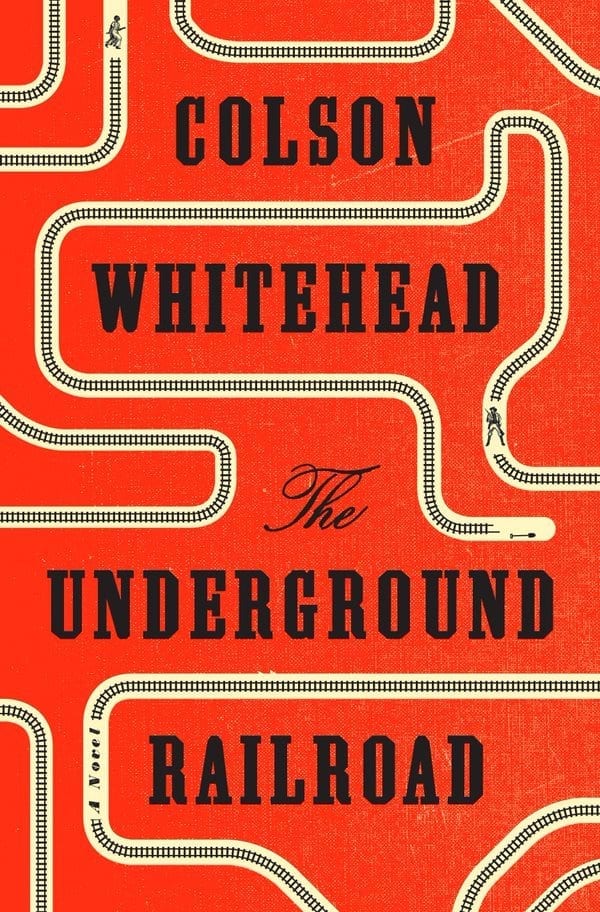
My Favorite Novel Published in 2016: The Underground Railroad by Colson Whitehead

Easily one of the most lauded novels of 2016, The Underground Railroad tells the story of Cora, an escaped slave who traverses the Underground Railroad — which in this book is reimagined as an actual underground railroad. At each stop, it seems like Cora has finally found safety and peace, or as much as safety and peace as she can hope for, until her life is shattered once again.

What affected me the most about this book was thinking about how the people with power control the narrative. Could there have been an actual underground railroad? There very well could have because white people have always held the power and if they didn’t know about it, it wasn’t the dominant narrative. It makes me sad for how much has been lost to history because the people with the least power were the only ones who witnessed it. (This is a very good book to read in the age of Trump.)

This book is hallucinatory and creative and the edges between fantasy and reality are deeply blurred. But the book has several overarching themes, just like Homegoing (which you’ll read about below). The biggest? Escaping slavery was only the beginning. Whether the horrors were experienced during Cora’s solitary journey or spread out along multiple generations like in Homegoing, they were there, they are still there, and they are one of the most shameful chapters of our country’s history.

American Heiress

My Favorite Nonfiction Book Published in 2016: American Heiress: The Wild Saga of the Kidnapping, Crimes and Trial of Patty Hearst by Jeffrey Toobin

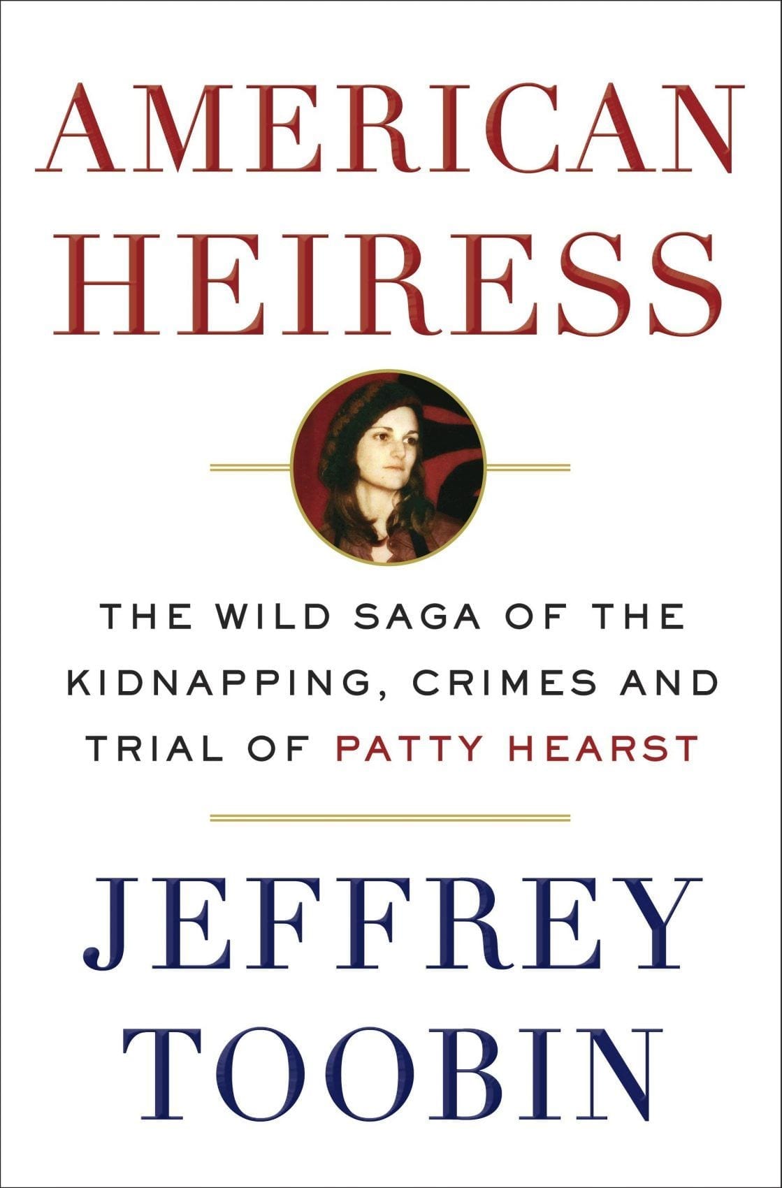
I went into reading this book knowing nothing about Patty Hearst except that she was kidnapped and forced to rob banks in the 1970s. That couldn’t have been a better way to go into reading American Heiress. Knowing so little about the story made it all the more exciting — and this story was absolutely bonkers.

Patty Hearst, a 19-year-old heir to the Hearst publishing fortune, was kidnapped by a group of young radicals called the Symbionese Liberation Army in 1974. After a period of time, she began to believe in their cause and decided to join the group as they robbed banks and planned bombings. It took years before the police were able to track her down. Also, a shootout with the SLA was the first live news event ever to air on TV. How crazy is that?

I’ve read Jeffrey Toobin’s work before, but I have not enjoyed a single book this much since The Martian. It was a wild, insane, dense, satisfying ride and I’ve been discussing Patty Hearst with everyone I talk to since then.

Homegoing

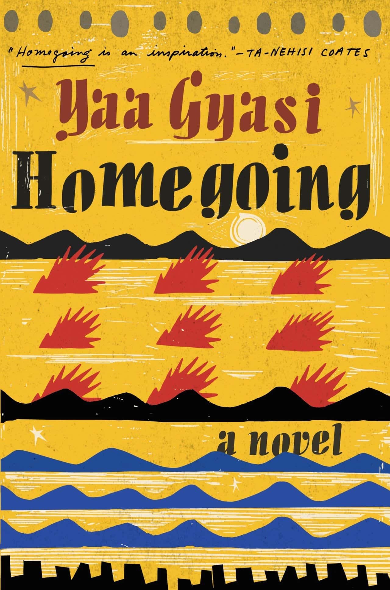
Homegoing by Yaa Gyasi (2016)

This is one of the powerhouse novels of 2016, but I couldn’t believe that Homegoing is Ghanaian-American author Gyasi’s first novel. She’s in her twenties. You would expect a book this intricately and emotively written to be the crowning lifetime achievement of a much older author.

Homegoing tells the story of two half-sisters in what is now Ghana. One is sold into slavery; the other is married to a slaver and stays in Africa. The book goes on in vignettes, telling stories of a family member on each side over the course of seven generations, lasting into the present day. In Africa, the characters wrestle with war, kidnappings, mental illness, the long-term effects of colonialism. In America, the characters struggle with slavery, imprisonment, Jim Crow, the heroin epidemic.

There is a belief held amongst some Americans that injustices against black Americans ended with the abolition of slavery. This book is the single best example I’ve ever seen of showing different forms of black bondage being replaced, one after the other, with the same goal of keeping them second-class citizens. (Today, it’s most clearly manifested in our criminal justice system.) Illustrating injustice through the empathetic form of fiction is, in my opinion, the most noble thing a novel can do. Everyone needs to read this book, but the people who need to read it most will not do so.

Read Homegoing in tandem with The Underground Railroad. They share a lot of the same themes.

The Autobiography of Malcolm X

The Autobiography of Malcolm X: As Told to Alex Haley by Malcolm X and Alex Haley (1965)

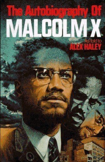
When I moved to Harlem, I made an effort to read more books by Harlem authors, and I discovered a masterpiece. It blows my mind how much Malcolm X was overlooked in school when I was growing up — I knew so little about him when I started the book — and The Autobiography of Malcolm X is one of the most powerful self-told stories I have ever read.

So many things touched me that I didn’t expect. His discovery of dance (which he found in Boston!) and his love for Harlem. His days in prison, following an arrest for robbery, which he spent reading books every hour of every day. Finding religion in the Nation of Islam and just how intense that organization was. And how he was widely, erroneously reported to be a terrorist until he was gunned down.

This is also one of the best travel memoirs because of how much it changed his point of view. Malcolm X believed that the races were off segregated and gave speeches to this effect — until he went to Mecca, joyfully worshipped with Muslims of every color and background, and declared that he had been wrong all along.

The Short and Tragic Life of Robert Peace

The Short and Tragic Life of Robert Peace: A Brilliant Young Man Who Left Newark for the Ivy League by Jeff Hobbs (2015)

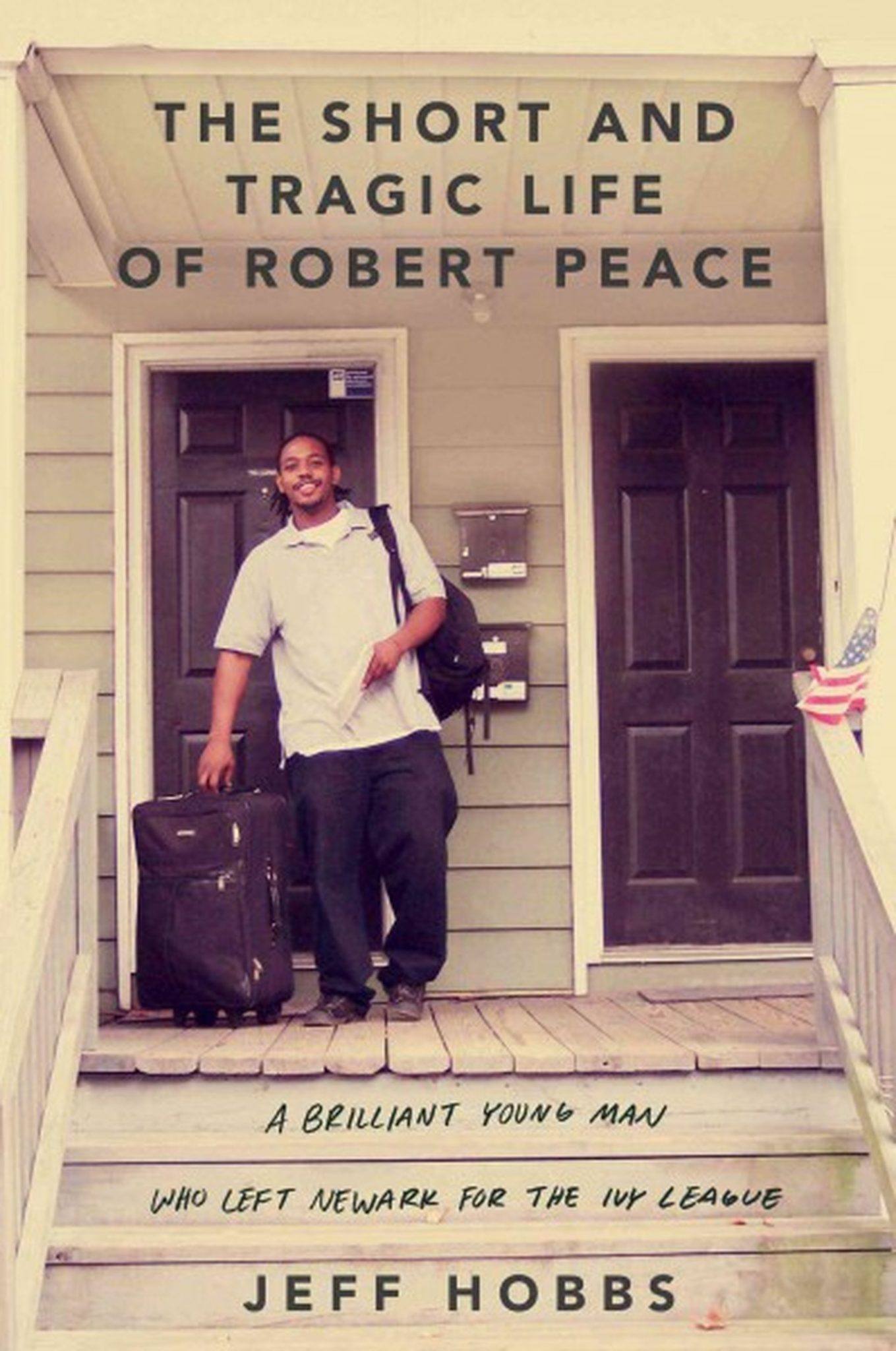
No book ripped me open to my soul as much as The Short and Tragic Life of Robert Peace. Robert Peace grew up in a rough area of Newark, surrounded by drugs and violence, but he was incredibly intelligent. Between the hard work he and his mother did, he got himself into a private prep school and, eventually, Yale. A few years after graduation, however, he was murdered in a drug dealing dispute. This book, written by his college roommate, seeks to answer, “Why?”

And for me, that “Why?” was filled with agony. Even knowing that Rob ends up dead, I felt sick seeing it unfold slowly. And I’m still trying to figure out how it happened. Rob was anything but a burnout; even after college, he kept his life at home and built himself communities in Rio and Croatia. He dealt drugs for the money; he worked as a baggage handler for the travel privileges. He always had an end plan, but it was just out of his grasp.

Did Yale fail him? Could his death have been avoided if he had a mentor? Would he have moved on if he hadn’t been fiercely loyal to his family and friends? Who can be blamed for this?! We’ll never know. And that hurts. But perhaps this book will give us the steps to prevent other kids in Rob’s extraordinary position from going down the same path.

Half of a Yellow Sun

Half of a Yellow Sun by Chimamanda Ngozi Adichie (2007)

I discovered Chimamanda Ngozi Adichie last year and two of her books, Americanah and Purple Hibiscus, were on my list of favorites last year. This year, she cemented her status as one of my favorite writers as I read Half of a Yellow Sun, a tale of war and the short-lived republic of Biafra in what is now Nigeria.

What I love most about Adichie’s books are her characters. With the possible exception of Ifemelu, the protagonist in Americanah, Adichie writes characters that I love so much that I want to hug them and listen to them tell their life stories. Half of a Yellow Sun tells the story of an extended family and the important people in their lives as they go from a comfortable middle-class existence to living through war, kidnappings, and starvation. By the time I finished, I was still thinking about those characters and how much I loved them.

I think it’s good to read a book about a period in time that you know nothing about. I never had a clue about Biafra and I’m so glad I know about it now.

Shrill

Shrill: Notes from a Loud Woman by Lindy West (2016)

I’ve been a big fan of Lindy West’s writing since her horrific and pants-shittingly hilarious viral review of Sex and the City 2. Shrill was an easy purchase, and it’s one of the best collections of essays I’ve ever read. The funny, truthful stories touch on everything from feminism and the media to body image and life as a plus-size woman to cyberbullying.

This year I read a lot of memoirs and essay collections by celebrities (Shonda Rimes, Amy Schumer) and internet celebrities (Luvvie Ajayi, Mark Manson). In nearly every case, the books were disappointingly uneven with some stronger essays and some weak ones. Not this book. West was the only exception. Every story in this book is razor-sharp and meaningful, whether funny or serious. There isn’t a weak link in the bunch.

I wanted to cheer when I finished this book because I feel like West and I want to see the same kind of world emerge in our lifetimes someday.

Dear Mr. You

Dear Mr. You by Mary-Louise Parker (2015)

It’s always a nice surprise when an actor you enjoy turns out to be a fantastic writer, and not of the fun-time-memoir variety. Mary-Louise Parker is my latest example, and Dear Mr. You is a phenomenal collection of stories that blur between poetry and prose.

Each letter in the book is addressed to an important man in her life. To former lovers. To family members. I absolutely love how she writes each story — it’s ambiguous enough that you can’t quite figure out who is who, so if you’re looking for juicy Billy Crudup gossip, you won’t find it here. In fact, this writing style inspired me when I wrote my 10 Love Stories post.

And this is a book with a great ending. The final letter to a final Mr. You is perfect.

The Lost Daughter

The Lost Daughter by Elena Ferrante (2008)

Last year, I discovered Elena Ferrante and Neapolitan Novels, which are now some of my favorite books of all time. This year, I delved in deeper to her other works. The Lost Daughter was my favorite. This wisp of a novella has everything that I love about Ferrante’s work: deeply uncomfortable introspection (but not on the level of some of her other books), keen observations of family dynamics, and the ferocity of Naples.

Leda is a divorced, new empty nester in her late 40s and she takes a trip to the seaside near Naples. While there, she observes a young mother with her daughter and ruminates on motherhood, including what some would consider an unforgivable act she committed while her daughters were young. That same impulse drives her to commit another act on the beach at night.

I love short, tight books that don’t waste a single word. (Movies, too. That’s why the 87-minute Dodgeball is one of my favorite comedies.) This book is perfect.

Swing Time

Swing Time by Zadie Smith (2016)

Two girls grow up in the housing projects of northwest London. Both from underprivileged backgrounds. Both biracial. And both with an insatiable love for dance — but only one is talented enough to make it professionally. While I’ve been wanting to read Zadie Smith’s books for quite some time, Swing Time was the first one I picked up, and it won’t be the last.

I’ve been reading a lot about female friendship — the deep love and furtive hate, the competition and sabotage and loyalty and cruelty. The best novels about female friendship are undoubtedly Elena Ferrante’s Neapolitan Novels. But Swing Time covers female friendship in a different direction — still with lots of highs and lows, but with the difference of raw talent vs. perseverance and nature vs. nurture. The book goes to places I did not remotely expect.

Another thing that I really loved about this book was its depiction of London. Cold, sophisticated and rough, yet familiar and welcoming, like the soft gray blanket you should probably get rid of but sits at the foot of your bed anyway.

Hillbilly Elegy

Hillbilly Elegy by J.D. Vance (2016)

It’s the book that everyone is talking about: “Read Hillbilly Elegy to understand why Trump won the election.” I wouldn’t go that far, as the book is much more a personal memoir and hardly dives into politics at all. I will say this: this book highlights a population that is underrepresented and misunderstood in American culture.

The “hillbilly” culture, a term Vance uses with pride and ownership, is only one segment of white working class voters that were power players in the 2016 election. But what a culture. I knew very little about the people who grew up in Appalachia and left for factory jobs in places like Ohio. I had no idea that violence was pervasive throughout the families, generation after generation, that education was so poor, and that so many of them had fallen to opioid addiction.

Don’t expect this book to give you a eureka moment or give you further insight into the election. But do use this book to learn about and empathize with a segment of the population who has had it very rough in the last few decades.

Without You There Is No Us

Without You, There Is No Us: My Time with the Sons of North Korea’s Elite by Suki Kim (2015)

No other country on the planet is more closed off to outsiders than North Korea. Most of the North Koreans that outsiders meet have escaped after imprisonment. But what about the ruling elites? They are perhaps the greatest mystery of all.

Suki Kim went undercover and got to see North Korea’s most privileged class close-up. In Without You, There Is No Us, she tells her account as a teacher at a university. She could trust no one. Her every move was monitored. Her students were earnest and childlike, yet lied with cheer and alacrity. Throughout this book I had the unsettling feeling that I was being watched — not unlike what I’m sure Kim felt 24/7 during her time teaching in Pyongyang.

Anyone who has a passing interest in North Korea should read this extraordinary book. For me, it confirmed my decision to not visit North Korea. At this point in time, I believe there is no ethical way to do so.

What’s Next for 2017?

I’ve decided to throw myself back in and take on Popsugar’s 2017 Reading Challenge! The challenge looks more difficult than 2015’s.

I’ve also given myself additional parameters: every month I will read at least one novel, at least one work of nonfiction, at least one book published in 2017, and at least one book by a person of color. I’ve also identified the twelve toughest categories (like “a book with more than 800 pages” — eek!) and will conquer one tough category per month so I won’t be overwhelmed.

Unlike last time on the challenge, I’m going to make an effort to read books I want to read first and seeing where they fit in rather than picking them out based on the category.

Some books I’ve got my eye on for 2016: Evicted: Poverty and Profit in the American City by Matthew Desmond; Postcards from the Edge by Carrie Fisher; Blood, Bones and Butter: The Inadvertent Education of a Reluctant Chef by Gabrielle Hamilton; White Teeth by Zadie Smith; Born a Crime: Stories from a South African Childhood by Trevor Noah; and perhaps Alexander Hamilton by Ron Chernow or David Copperfield by Charles Dickens (gotta get that 800-page book somehow!).

What was your favorite book of 2016? How do you choose what to read? Share away!


from Adventurous Kate http://www.adventurouskate.com/my-favorite-reads-of-2016/

Wednesday 28 December 2016

How to Watermark Images in Lightroom

While it seems that adding watermarks to images does little nowadays to deter image theft, watermarks can still be very useful for photographers and business owners for promoting their work and their brands across websites and social media. Unfortunately, for those who are just starting out, adding a simple watermark to images can be a rather painful experience, especially if they are not already familiar with the process using such software tools as Photoshop. Thankfully, Adobe has made it easy to add watermarks to images in Lightroom, allowing one to not only add a watermark to a single image, but also to apply it to all images during the export process, which can save a lot of time and frustration when dealing with batches of images. In this article, I will show how to use the built-in watermark tool that is readily available in Lightroom in order to quickly add watermarks to images.

Watermarking Photos in Lightroom

Tasman Glacier, New Zealand at Sunset. Image watermarked via Lightroom.
NIKON D810 + 24-120mm f/4 @ 32mm, ISO 64, 1/4, f/8.0

1) Why Watermark Images?

The first question you might ask yourself is – should you watermark your images? There are many opinions on this matter. Some argue that watermarks prevent theft (which I and many others disagree with), allow self-promotion and help build brand recognition, while others argue that adding watermarks spoils the viewing experience and does more harm than good. Let me quickly point out what I think about watermarks and when they should and should not be used.

  1. Unless your watermark visibly takes up the entire photo like in the image below, it can often be easily removed in Photoshop using standard tools. So if you are worried about theft and copyright infringement too much, either do not post your images online or post them in a small size with a gigantic watermark all over it. You will fend off all potential thieves for sure. I immediately close sites that show icon-sized images with huge watermarks. And I know that I am not the only one out there…
    Big and Ugly Watermark

    Big and Ugly Watermark

  2. On a more serious note, if your objective is self-promotion and building brand recognition (which should be your primary goal when adding your watermarks), then come up with a good strategy to add watermarks without spoiling the viewing experience (see tips below). This means making your watermarks small, but recognizable and placing them in a good, open corner spot in photographs close to image borders.
  3. Well-known photographers rarely put watermarks on their photographs, because they want to deliver the best (and unobtrusive) viewing experience. They also often post large images that occupy the whole screen. Why aren’t they worried about copyright? Because they are known and their images are recognized. If such photographs or “works of art” are stolen or reproduced elsewhere, the offenders would most likely be reported and caught quickly. Am I saying that unless you are a well-known photographer you should be adding watermarks to your photos? Of course not. I believe you should worry less about theft and focus more on making better photographs.
  4. If watermarks are used properly, they can help promote your work instead of doing harm. You are not a stock photo agency, so stay away from large watermarks that span across your photos.
  5. And for all those “right-click disable” folks out there that do it on their websites – you are only spoiling the browsing experience of your visitors. I hate not being able to right-click and open links/images in new pages on websites and blogs. It is about time for you to understand, that if someone really needs to steal your image, they can just press the “Print Screen” button on their keyboards, then paste the screenshot in Photoshop and crop it to their liking!

Before I move on to specific instructions, I would like to provide some watermarking tips and best practices:

  1. Try to use a graphic logo instead of plain text for watermarks. If you do not have a logo yet, use short text with your name and Copyright © symbol.
  2. When using text watermarks, try not to add the word “photography” at the end of your name. If your name is not unique (just search Google), then either come up with a nickname or use your URL (below).
  3. If you have a short URL, you can post your website address instead of your name.
  4. When using text watermarks, use a standard and recognizable font rather than some gothic/italic/handwriting font that is impossible to read.
  5. Try not to use multiple lines of text for watermarks.
  6. Semi-transparent watermarks always look better and more professional than bold copyright imprints. If you decide to use a watermark, make it 60% or less transparent.
  7. Another good watermarking method is to add some space underneath each photo and then put your copyright information there. But you would have to use Photoshop and record actions in order to do that (not covered in this article).
  8. Put your logo/text watermark in the corners of your photos. Top-left, top-right, bottom-left and bottom-right locations typically work the best.
  9. If you do not feel like sharing your camera settings, remove your EXIF data from images, but only keep your copyright and contact information. This would just be an additional copyright protection layer for you in case your image is posted elsewhere.

2) The Watermark Position Dilemma

Because of the nature of photographs and their colors and patterns, finding a good placement for your watermark can be a problem. Where should it be placed and how? As I have pointed out above, the best locations for standard watermarks are near the top and bottom corners of your photos (unless you chose to add extra space to the bottom or the side of your photographs in Photoshop or other third party software). Which corner should you use for watermarks? I would say all of them! Why? Because every photo will be different and while one corner might work for one photo, that same corner might not for another. A gray watermark will not be visible on a photo with a gray corner where the watermark is placed. So you have two options – either to use a different shade of color that is visible in the same corner, or move the watermark to a different location. I prefer the latter for consistency, but it is totally your choice.

Now moving your watermark in photos would be extremely inefficient if you had to change your watermark every time you need to move it. That’s why the best method is to create multiple watermarks in Lightroom and put them in multiple locations. For example, I have 4 different Lightroom watermarks that I called “Top-Left”, “Top-Right”, “Bottom-Left” and “Bottom-Right”. All watermarks are the same (PL logo in white) – they are just positioned differently.

3) Creating a Text Watermark in Lightroom

Let’s go through the process of creating a text watermark in Lightroom. To access the watermark function in Lightroom, you can go to “Edit->Edit Watermarks…” (Lightroom->Edit Watermarks on Mac) or you can also access it from Lightroom’s Export window. I normally access it via the export window, which can be found in File->Export or pressing CTRL+SHIFT+E:

Lightroom Export Watermark

Once it comes up, scroll down and find “Watermarking”. Next, check the box in front of “Watermark:” and then select “Edit Watermarks…” from the drop-down menu. The “Watermark Editor” will come up that looks like this:

Lightroom Watermark Editor

The watermark editor is very easy and intuitive to use. The left bottom section is where you type the text and you can change the layout on the right side of the window. Let’s get started with typing the text. Put the copyright symbol (copy-paste it from here – © or press ALT + 0169 on PC / OPT + G on Mac) first, then put your name afterwards. On the right side of the screen, choose your desired font under “Text Options”. I personally like the “Myriad Web Pro” font, but you can use whichever font you want, as long as it is legible. Choose the style and alignment, then pick the color of the text. I would recommend to keep the color white, since colors rarely look good in text watermarks. The default Shadow settings should work fine, but if you want to make changes to the way the shadows appear, you can do that in this screen. Now scroll down till you see “Watermark Effects”:

Lightroom Watermark Effects

As I have pointed out before, you do not want the copyright watermark to be 100% visible, so it is best to make it semi-transparent. I typically use 50% opacity, but you can play between 30-80% to see what works for you. Keep “Proportional” size instead of “Fit” or “Fill”, and 10% typically works great. If your copyright text looks too small, increase the value to a bigger number.

The next task is to pick an “Anchor” point, meaning where your copyright will be located. As I have pointed out above, it is best to keep it in the top left/right and bottom left/right corners. Start with the top-left corner. Remember, our objective is to create 4 watermarks with different locations. Next, click “Save” and the “New Preset” window will pop up:

Save Preset - Bottom Right

Give it a meaningful name that will be make it easy to understand the location of the type of watermark. I called mine “Bottom-Right”, as shown above. Click “Create” and you will be returned to the Export screen.

Now repeat the task three more times and create 3 other watermarks for “Top-Left”, “Top-Right” and “Bottom-Left”. At the end, your “Watermarking” drop-down should look something like this:

Lightroom Multiple Text Watermark Templates

Now that you have the text watermarks created, how do you use them? Just select a bunch of photos in Lightroom, bring up the export window, then select one of the watermarks and click “Export”. That’s all!

Here is how I normally do it:

  1. Select all photos to be extracted in Lightroom
  2. Bring up the Lightroom Export window (CTRL+SHIFT+E / CMD+SHIFT+E)
  3. Select the “Bottom-Right” watermark (works best for most images)
  4. Click “Export”
  5. Once images are extracted, go through each one and identify the ones where logo does not look good or is invisible
  6. Select the images that need to have a different watermark placement, then bring up the export window once again and pick a watermark for a different location
  7. Click “Export” again and then overwrite the existing photo

You might need to repeat the steps 5-7 multiple times until you get the watermarks placed well. That’s all there is to it. Now let’s talk about graphic watermarks with logos.

4) Creating a Graphic Watermark in Lightroom

Now let’s move on to the cool stuff, which is adding a graphic watermark with your logo to images in Lightroom. No matter how good you make the text watermark look, it will never match a good-looking graphic logo. But to accomplish this, you will need your brand / company logo in a transparent format like PNG or GIF. Your logo cannot be in JPEG format, since JPEG has no support for transparency. If you had your logo developed professionally, you should have the original logo in vector/EPS format. You might also find a transparent PNG/GIF file in the same folder. If you cannot locate one, it is very easy to export your logo to a PNG format, as long as you have the source file. A transparent logo should look like this when opened in Photoshop:

PL Transparent Logo

Since we will be making your watermark semi-transparent, it is best to have the image in white rather than black. For a quick conversion in Photoshop, simply press CTRL+I / CMD+I to invert the logo colors:

PL Transparent Logo White

Now export the image from Photoshop by going to “File->Save for Web & Devices” and then pick “PNG-8” on the top drop-down. Make sure that “Transparency” is checked, as seen below:

Photoshop Save for Web PNG Logo

Once you have the file ready, you are now ready to use it in Lightroom. Oh and by the way, make sure that you are using a large version of your logo (at least 250 pixels wide). If you make it too small, your watermark will not look good when exported out of Lightroom, since Lightroom will have to up-size it for large photographs. If you use a high-resolution PNG image, Lightroom will automatically down-size it during the export process.

Let’s now pick some photos and bring up the Export dialog box in Lightroom by pressing CTRL+SHIFT+E. Make sure to check the box in front of “Watermark:” under “Watermarking”, then select “Edit Watermarks…” in the drop-down menu. A new window called “Watermark Editor” will come up:

Lightroom Watermark Editor Graphic

In order to use a graphic logo, we need to make sure to select “Graphic” on the top right corner of the window. Under “Image Options”, click “Choose” and find the logo you exported earlier. Once the file is chosen, you will see the logo show up right away on your photo preview on the left. You will also notice that the “Text Options” are now grayed out. Scroll down till you get to “Watermark Effects”:

Lightroom Watermark Editor Watermark Effects Graphic

Just like with the text watermark, you have to pick the right opacity – I normally leave mine at 50-60%. The size should stay “Proportional” and 10-15% size works great for most situations. If your logo is too close to the border, you can move it up/down and left/right by changing the “Inset” values in “Horizontal” and “Vertical”. In the above case, I went ahead and set +1 for both horizontal and vertical inset values, so that the logo is slightly moved from the edge of the image. Pick one of the Anchor points again (start with Bottom-Right) and then save the Preset with a new name like “Bottom-Right Logo”.

Now open up the Watermark Editor again, change the Anchor to bottom-left, click Save again and give it a name like “Bottom-Left Logo”. Do the same for top-left and top-right. Once you are done, you should have four watermarks for different watermark locations.

Now try to export a couple of photos and see how you like the result:

  1. Select all photos to be extracted in Lightroom
  2. Bring up the Lightroom Export window (CTRL+SHIFT+E / CMD+SHIFT+E)
  3. Select the “Bottom-Right” graph watermark (works best for most images)
  4. Click “Export”
  5. Once images are extracted, go through each one and identify the ones where logo does not look good or is invisible
  6. Select the images that need to have a different watermark placement, then bring up the export window once again and pick a watermark for a different location
  7. Click “Export” again and then overwrite the existing photo

Here is how my image looks like with the “PL” logo watermark:

Watermarking Photos in Lightroom

Watermark Applied to Image via Lightroom

The good news, is that you can use the above method for both vertical and horizontal images, so you do not have to extract your verticals separately. If all four corners are very bright and the white logo does not work, make another transparent logo in black and create additional watermarks. When watermarking very bright photos, use the black logo with 50% transparency and it will look great.

That’s it! Let me know if you have any questions and I would love to see how your logo comes out!

The post How to Watermark Images in Lightroom appeared first on Photography Life.


from Photography Life https://photographylife.com/how-to-watermark-images-in-lightroom