Adobe Lightroom is a complex piece of software, and it includes countless features that are buried beneath the surface. In this article, I will cover four useful Develop options that aren’t obvious at first glance, ranging from precision cropping to local color adjustments. If you are a Lightroom guru, you certainly may use each of these already; however, for most Lightroom users, these features are somewhat difficult to find.
1) Precision Cropping
One thing that bothers me about Lightroom is that you cannot crop your images to pixel-level precision. Especially on a small monitor, it is difficult to crop to exactly the right spot in a photo. You can get close, certainly, but Lightroom’s cropping tool does not allow the fine adjustments that I sometimes need.
This doesn’t matter for the vast majority of images, but there are some scenes where it is important. Consider a landscape where you want to include as much of the sky as possible, but there is a tree branch at the upper corner; by cropping at the pixel level, you could include the absolute largest amount of sky possible. If you plan to make a large print, Lightroom’s standard level of precision simply is not enough.
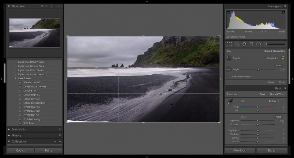
Luckily, there is a way to remedy the problem. It certainly is not perfect – and not everyone needs such a careful crop in the first place – but you can make more precise adjustments simply by clicking the “crop” tool, then closing the sidebars of your editing window. By doing so on a small computer monitor, you can nearly double the size of your photo on-screen, which correspondingly improves your cropping precision. Look at the image below:
This is the standard cropping window in Lightroom. As you can see, the bottom-left corner of this image is white and featureless. (This is a panorama, and the lack of detail is a result of the photo-merging process.) I want to include as much detail as possible above that corner, but I clearly didn’t want to include any of the white area itself. Here, though, the cropping tool is not very precise; it is difficult to adjust the image exactly how I want.
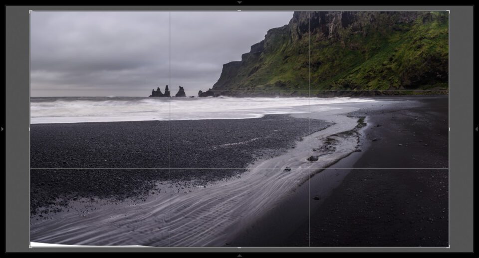
To make the most precise crop possible – getting rid of the white space without removing any of the beach itself – I needed to collapse the left and right sidebars. See the screenshot below:
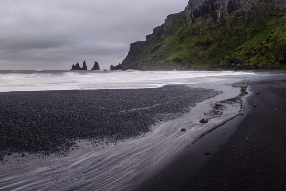
This gives me much more room! I can collapse the sidebars without closing the crop tool. Now, it is much easier to get the exact frame that I want. The final version is below:
I don’t use this technique very often, but it is invaluable for certain photographs. For your trickiest images, this extra precision is more than welcome.
2) The Alt Key
One of my personal favorite Lightroom tricks is the unassuming Alt key (Option for Mac users). If you are in the develop module, hold down Alt while making an adjustment; chances are, something about your screen will change!
The Alt key functions as a preview. If you hold Alt while adjusting exposure, Lightroom will show you which highlights are blown-out to white; the same is true if you adjust highlights or whites. Likewise, if you hold down alt while adjusting shadows or blacks, you will see which areas of your photo have gone completely dark.
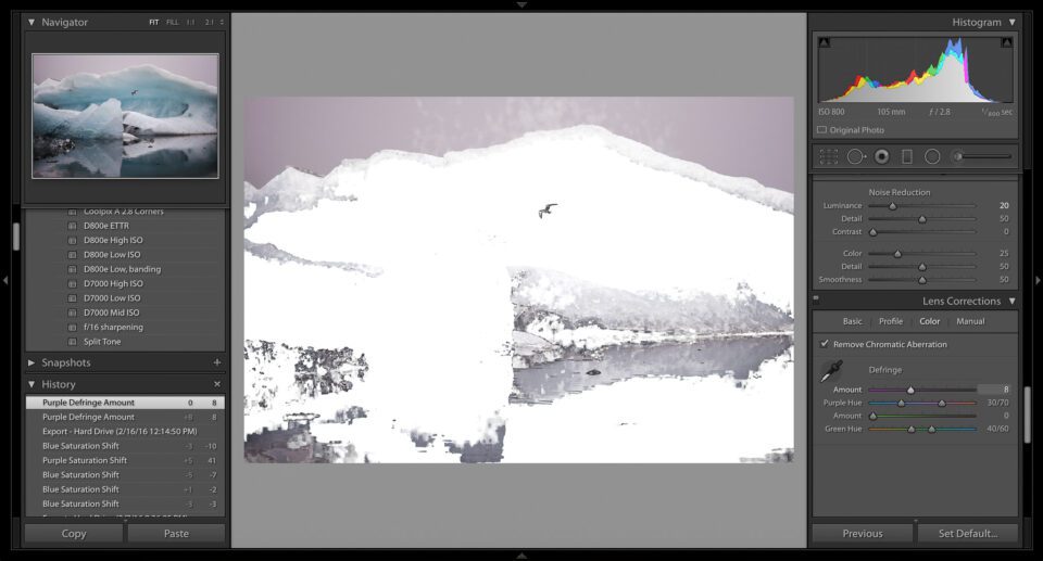
Many common adjustments have a built-in preview. One of my favorites is the Defringe option under Lens Corrections > Color. This option lets you remove color fringes, or longitudinal chromatic aberrations (as explained in this article). When you hold down the Alt key, Lightroom shows you all the colors that can be removed through the fringe correction tool. This is incredibly useful! Check out the photograph below:
In the image above, everything in purple can be eliminated by a strong fringing correction. (In this case, there wasn’t actually color fringing; this is simply an example photo with a lot of purple.)
Here is a list of all the adjustments that open previews with the Alt key:
- Basic
- Exposure: Shows which highlights are blown-out to white
- Highlights: Shows which highlights are blown-out to white
- Shadow: Shows which shadows are completely black
- Whites: Shows which highlights are blown-out to white
- Blacks: Shows which shadows are completely black
- Split-Toning
- Hue sliders: Previews the hue that you are adding to your shadows or highlights
- Balance: Previews the balance between shadow and highlight colors (read more)
- Detail
- Sharpening amount: Makes the photograph black-and-white to preview sharpening without any color noise
- Radius: Exaggerates sharpening adjustments to show the radius, as if you have applied a high-pass filter
- Detail: Again, appears as if you applied a high-pass filter – only shows the edges that will be sharpened
- Masking: Very useful – darkens everything that won’t be sharpened
- Luminance noise reduction: Makes the photograph black-and-white to preview without any color noise
- Luminance detail: Makes the photograph black-and-white to preview without any color noise
- Luminance contrast: Makes the photograph black-and-white to preview without any color noise
- Lens Corrections
- Defringe amount: Shows which colors are detected by the Defringe tool
- Defringe hue: Turns black everywhere that is affected by the Defringe tool
- Effects
- Midpoint: Darkens the vignette that you have applied, allowing for a better preview
- Roundness: Darkens the vignette that you have applied, allowing for a better preview
- Feather: Darkens the vignette that you have applied, allowing for a better preview
- Highlights: Darkens the vignette that you have applied, allowing for a better preview
There are other adjustments that change when you press the Alt key – the gradient mask centers itself, for example – but the items above give you a preview of your edits. Depending upon the photograph that you are processing, they can be incredibly helpful.
3) Match Total Exposure
Another useful feature of Lightroom is the Match Total Exposure setting. Essentially, this option lets you take a series of photographs – all with different exposures – and then adjust them to match the same level of brightness.
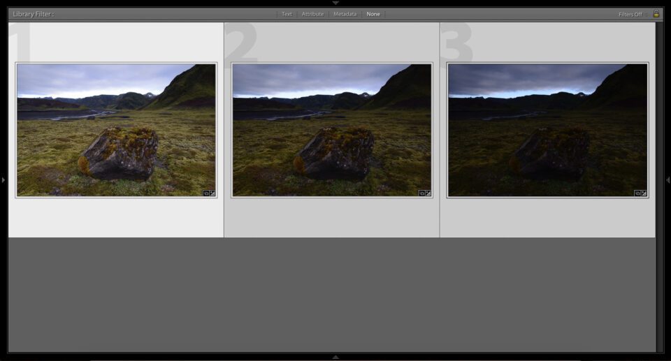
The process is quite simple. First, hold down the Control key (Command on Mac) and click on each photo that you want to be the same brightness. Then, click again on the photograph that you want them all to match. (Every photo should be highlighted now, but the “target” image should be highlighted most prominently.) See below:
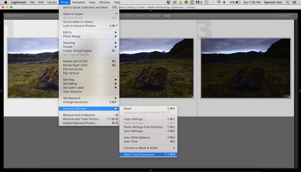
The next step is to click “Photo” at the top of the page, then “Develop Settings” and “Match Total Exposure.” See the photo below:
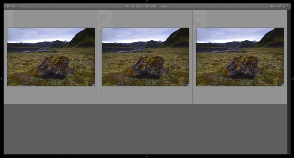
Ultimately, Match Total Exposure gives you a result like this:
I use this setting quite a bit when I expose to the right. I may take a single photograph at the “proper” exposure, then a series of increasingly bright photographs. I can use the Match Total Exposure setting to make all of the photographs look like the first, “correct” image – then compare each subsequent photo to see which ones retain detail in the highlights.
There are other uses, as well. If you want to blend several photos into a panorama, they should be the same brightness; if that is not the case, for whatever reason, you need to equalize their exposures. Doing this manually is a painful task, but the Match Total Exposure option is incredibly easy.
Note that Match Total Exposure works based on your camera settings. If you took a photograph indoors, for example, and then turned on an extra light (without changing your settings), the Equalize Exposure option wouldn’t have any effect – even though your second photo would be brighter.
4) Local Color Adjustments
One adjustment that I just recently found – and, honestly, have only used for experimentation at this point – is an interesting local color adjustment tool.
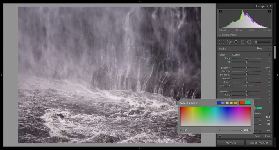
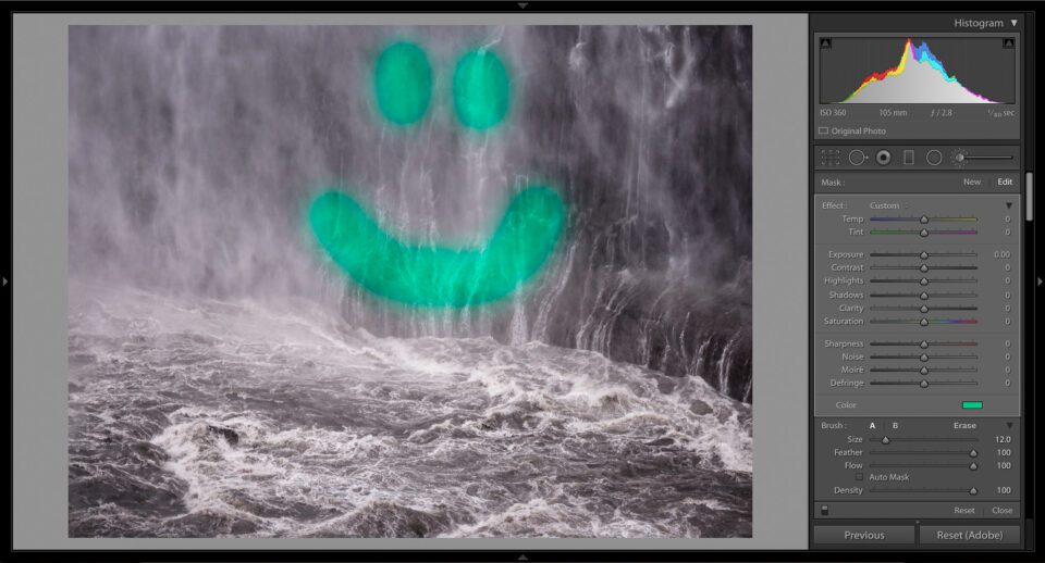
This option is hiding in plain sight under any local adjustment tab. Click on the gradient tool, for example; the lowest slider in the gradient menu is the “Defringe” tool. Below that, though, is another option: Color. By clicking on the gray box to the right of the word color, you open up the local color adjustment tool. See the screenshot below:
Once you pick a color, you can draw on the photograph like any other local adjustment tool. Do you want to change the color of a photo’s sky? This option was made for you.
Although I haven’t yet used the local color tool extensively, I can see its value. Portrait photographers, for example, might want to enhance the color of their subject’s face – making someone’s eyes look more natural, for instance.
Even a landscape photographer may find this tool useful. I, for one, think that the photo above is too gloomy; the local color adjustment fixes the problem! The improved version is below:
As you can see, the local color adjustment has helped me turn a sad photo into something happy. For me, that’s the real value of post-processing.
5) Conclusions
Lightroom is not an easy program to use, and some of its useful tools are hidden in unexpected places. None of the four features in this article are essential Lightroom adjustments, but each has its uses. Whether you need a more precise crop or a preview of your adjustments, Lightroom’s built-in options have what you need; it just takes some work to find. Hopefully, this article showed you some of those halfway-hidden features, making it easier to process your photographs exactly the way you want.
The post Four Hidden Lightroom Features appeared first on Photography Life.
from Photography Life https://photographylife.com/four-hidden-lightroom-features
No comments:
Post a Comment