Earlier this week I posted a portrait as the next installment to our How Was This Picture Taken series. Most of our readers took this as an opportunity to stretch their brains a bit and try to use visual clues within an image to figure out how it was taken. They are rewarded all of the internet points.* A few, missing the entire point of the post in an effort to be “right”, decided to go directly to the image’s EXIF data and rattle off the technical details of the image. They are rewarded zero internet points.*
*internet points are imaginary, useless and non-redeemable for anything except for maybe bragging rights
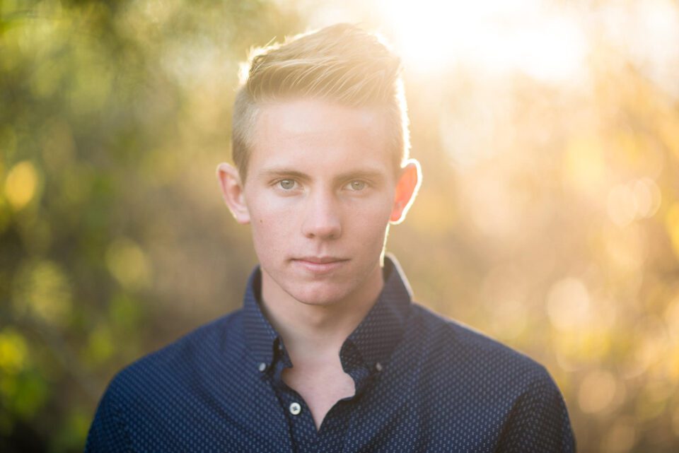
If you need a refresher, here is the original post and the photo in question (this time with metadata). I highly suggest you click on the image and view it that way versus embedded in the post. The image quality is better and it’s easy to compare to the next image:
As you can see from the caption with the metadata information, I used a full frame camera with an 85mm lens at an aperture of f/1.4. This is my go-to camera/lens combination for portraits like this. Whenever possible I shoot at f/1.4, which gives the background a beautiful, dreamy look like you see here. A few people guessed that I spot metered for the face, which is indeed what I did.
This image was taken in Fort Collins, CO near the Poudre River. I positioned Sander about 10 feet in front of some bushes that were growing near the river. With the sun behind him, there were specular highlights on the leaves from the direct sun that was hitting them. At an aperture of f/1.4, these highlights turned into the soft, appealing bokeh you see here.
Since the sun was behind him, I also used a white reflector to add a bit of fill light to the side of his face that was away from the sun (due to the reflector, you can see a very soft shadow from his collar on his neck). Some people guessed that I used a secondary light source like a strip light or an LED panel for fill, but this wasn’t the case. I had him standing in open shade with plenty of light coming from the sky (which created the horizontal catch lights in his eyes) to keep shadows to a minimum. No additional lighting was used to compliment the sun.
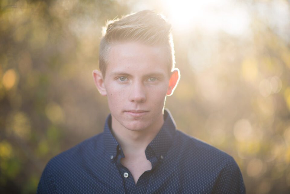
Now let’s take a look at the original (again, click on it and you can easily toggle back and forth between the original and final image):
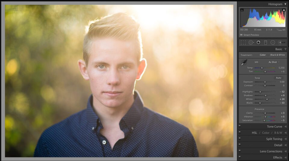
Can you tell what was done to it? You should be able to tell that it’s now warmer and has more contrast than the original. Here’s a screenshot of my Lightroom settings so you can see what I did:
Not shown in these settings are also a slight curve adjustment to make everything pop a bit more and split toning to warm things up a bit. I also used Lightroom’s lens correction for the particular lens I used. If you compare the original to the edited version, you’ll also see that I removed a few small blemishes, which is pretty standard for any portrait work. No additional masking or dodging of Sander’s face was involved.
You might think this is all I did to this image. I could have stopped there and been happy, but since I liked this image so much, I wanted to add just a little something extra. Maybe if you look at the image without it you’ll be able to notice:
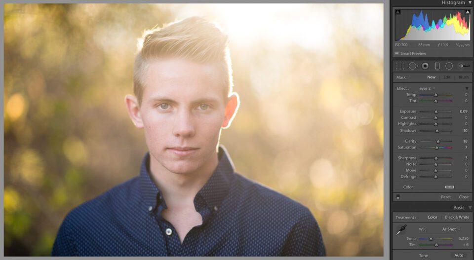
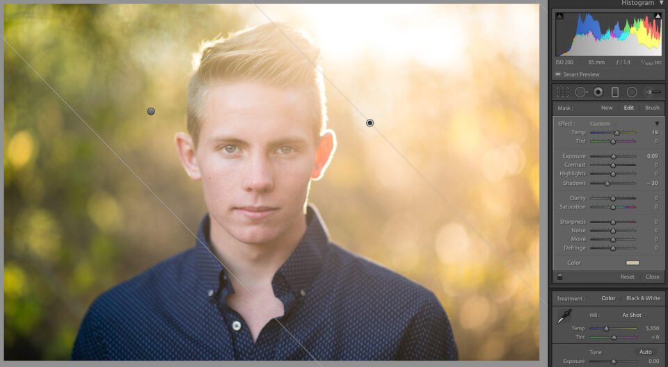
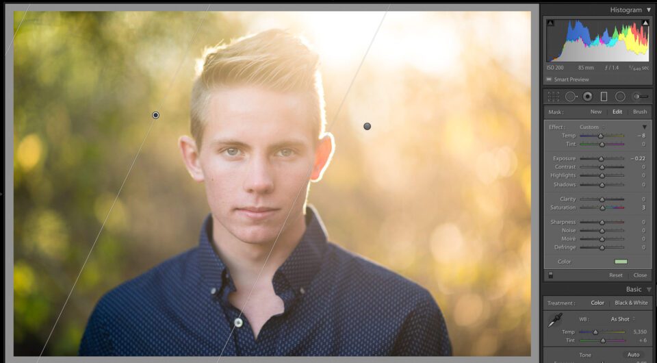
Doesn’t it look more plain? That’s because I added two colored gradients, one to each side. I added a slightly overexposed light yellow gradient coming from the top-right corner (which enhances the sunlight) and a slightly underexposed green gradient coming from the upper-left side (which enhances the foliage).
Here are screen shots of both gradients and their settings:
Once you know to look for it, this is an effect you’ll see used occasionally in portrait and wedding photography. I never try to go too crazy with it (some people add reds, blues and other colors), but it does come in useful when you want to add a little something extra, yet subtle, to your images. I should also note that this was done before Lightroom introduced the ability to use an eraser brush on portions of a gradient, so if you look closely you might see a very slight tint of green on his hair.
Finally, at what point during the photo session did I take this photo? This was one of the last images of the day. I find that almost everyone starts out portrait sessions wanting to do big “cheese” smiles. That’s what we’re taught to do in front of the camera from the time we’re old enough to smile. Photos of a nice big smile are great, but I also like to get some that are more calm and relaxed, as it’s actually a more natural look for our faces (not to mention most teenagers prefer a more “moody” photo to a big smile). This is difficult to do until the end of a session. By that point, my subjects trust me and are more willing to do something a little different, even if it’s only as simple as not smiling for a photo.
Hopefully this was fun for you and you learned something along the way. It was great reading all of your guesses and responses. Thanks for playing along and I’ll be on the lookout for another photo to use for the next How Was This Picture Taken!
The post How Was This Picture Made #5: The Answer appeared first on Photography Life.
from Photography Life https://photographylife.com/how-was-this-picture-made-5-the-answer
No comments:
Post a Comment