Have you ever wondered why you are instantly drawn to some photographs, but not to others? Or why some of your images lack that wow factor that you see in other’s. It may be related to how you compose your pictures. How a photograph is composed has a huge impact on how long we look at it. The longer our brain is allowed to wander through an image, the more likely we are to like it. Photographs that are not composed well do not have staying power, and are quickly discarded by our brain. In this article I want to discuss four very basic compositional tips. I won’t be talking about the “rule of thirds” or “leading lines”, but rather four pointers you should consider before you take a picture. These tips will save you a lot of post processing time, and will allow you to create much stronger images.
1) Horizontals and Verticals
When our brain sees something that it knows should be horizontal, like a distant horizon, but it isn’t, warning bells go off. Instinct tells us that there is something wrong. This usually translates into “I don’t like this photo very much”. The same thing happens when objects that should be vertical, like a building, are not.
Horizontals are a relatively simple thing to fix. It just takes practice and being aware of the horizon before you click your shutter. In most cameras you can turn on a grid display in the viewfinder. Try to make a conscious effort to level the horizon so that it is parallel with one of the gridlines. I have a tendency to drop my left elbow when I am holding my camera. I have to work hard to remember to lift it up so the Gulf of Mexico doesn’t drain off to the east!
This first shot of a windsurfer doesn’t look right because the horizon is tilted.

NIKON D800 + 80-400mm f/4.5-5.6 @ 195mm, ISO 200, 1/3200, f/6.3
Being more aware of the horizon led to a much better image here.

NIKON D800 + 80-400mm f/4.5-5.6 @ 195mm, ISO 200, 1/3200, f/6.3
Verticals can be a bit more challenging to keep upright in the viewfinder. There are two different issues that can happen to vertical lines. The first issue is similar to a slanted horizon above. It happens when the camera is rotated, as is illustrated in this next photo. Notice how the power poles are not standing upright.

NIKON D7100 + 200-400mm f/4 @ 280mm, ISO 400, 1/320, f/18.0
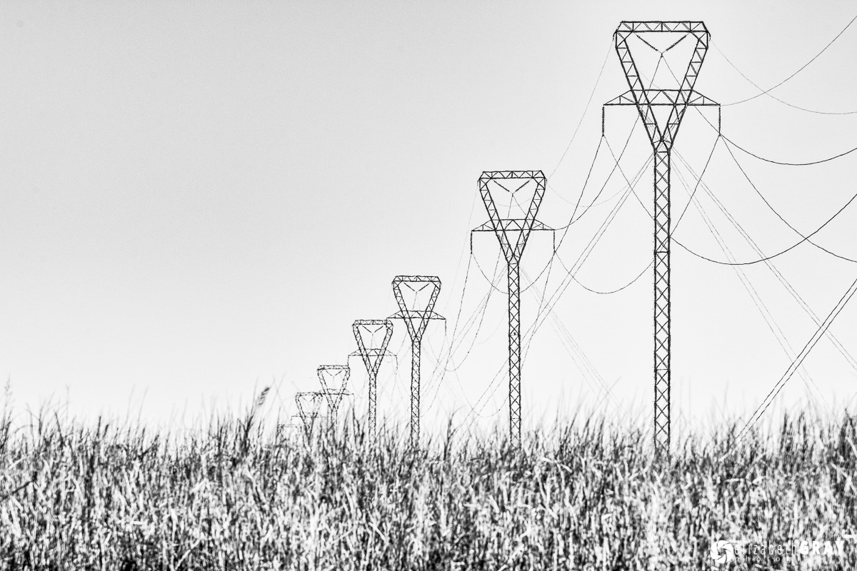
In this situation, you need to turn your camera so that the poles are vertical. Use the layout grid in the viewfinder to help you do this, just like you did to level your horizon. For this shot, I was riding in a boat, so keeping my horizon level and verticals truly vertical took a bit more care. Here is a second image shot just a few seconds before this last one, and converted to black and white.

NIKON D7100 + 200-400mm f/4 @ 280mm, ISO 400, 1/640, f/13.0
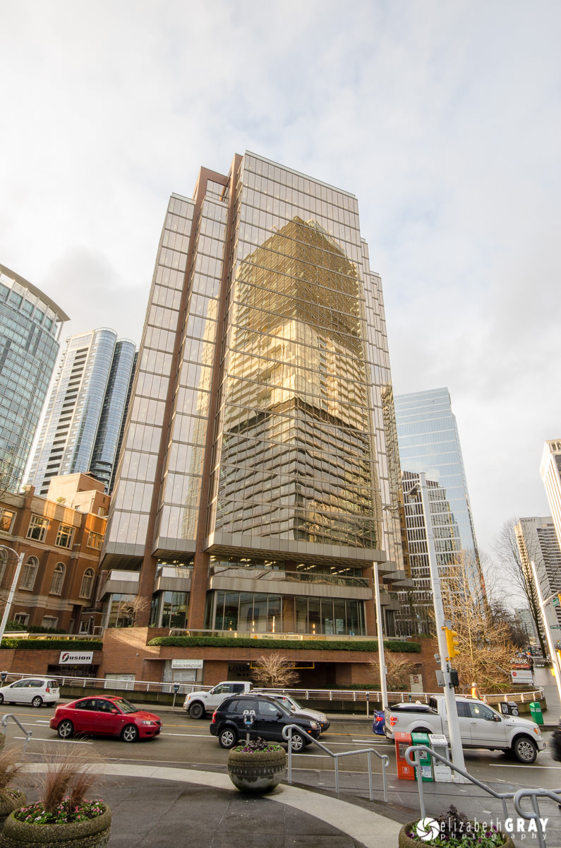
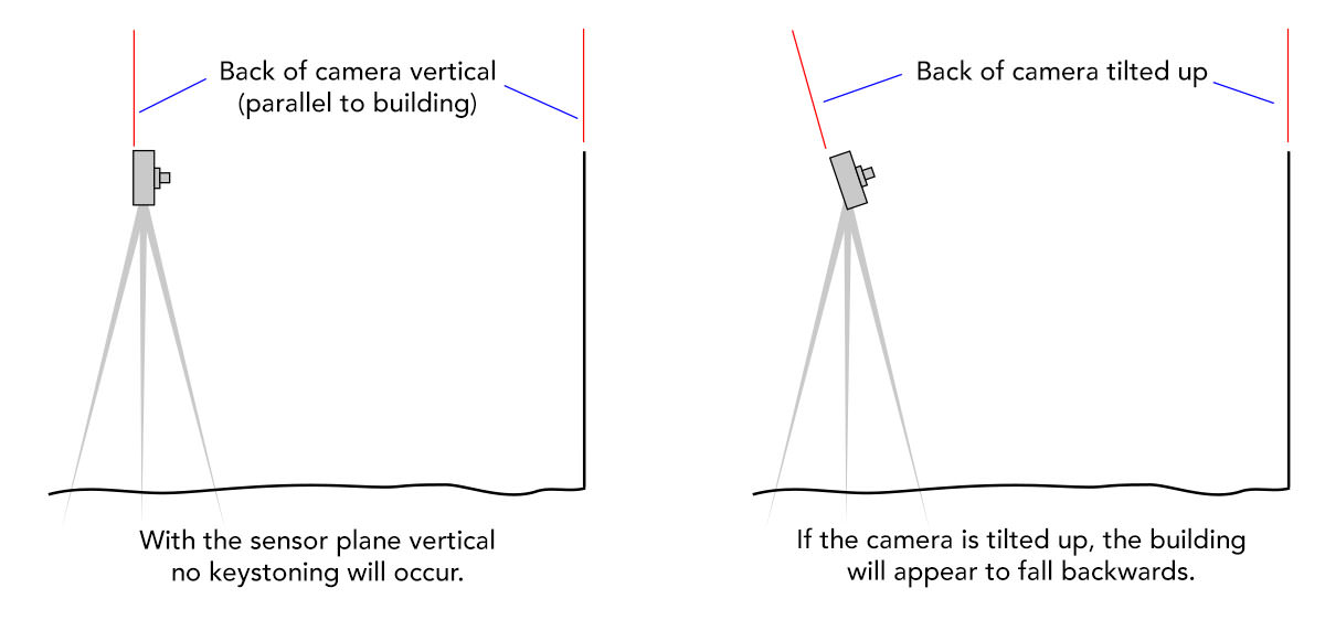
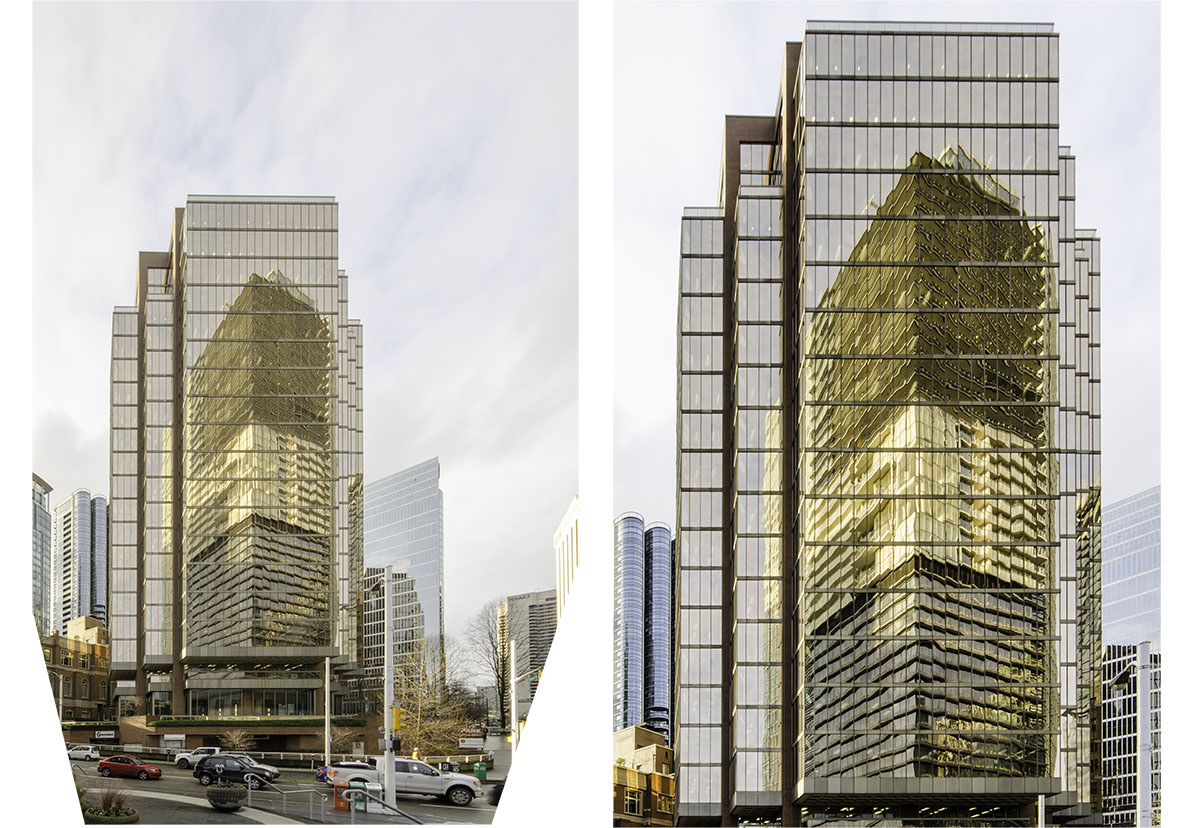
The second situation that can occur with vertical lines can be a bit more difficult to correct in-camera. I mention it in this article so you can be aware of it and correct it if possible. However, sometimes a cure can only be found using post-processing software or an expensive tilt-shift lens. In this photo, notice how the vertical building appears to be falling backwards. This is an effect called keystoning. Keystoning is defined as the converging of lines that are supposed to be parallel. It occurs when the sensor plane (aka the back of the camera) is not vertical.

NIKON D7000 + 10-20mm f/4-5.6 @ 14mm, ISO 250, 1/15, f/16.0
If at all possible, try to keep the back of the camera parallel to the face of the building so that the sensor plane remains vertical. In this sketch, the camera on the left will not cause any keystoning while the camera on the right will.

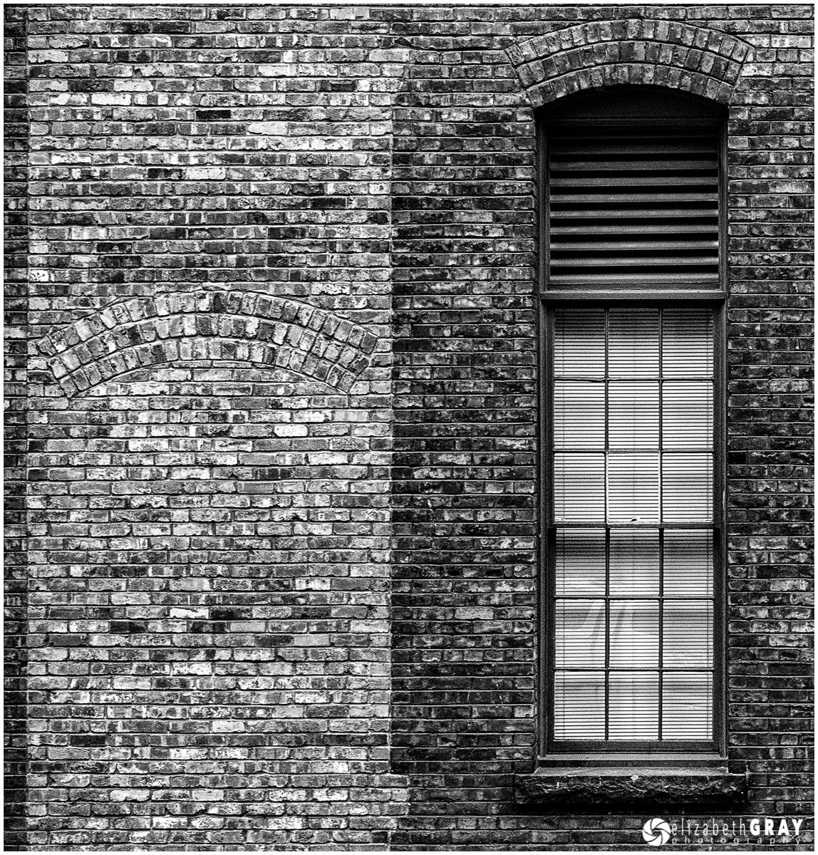
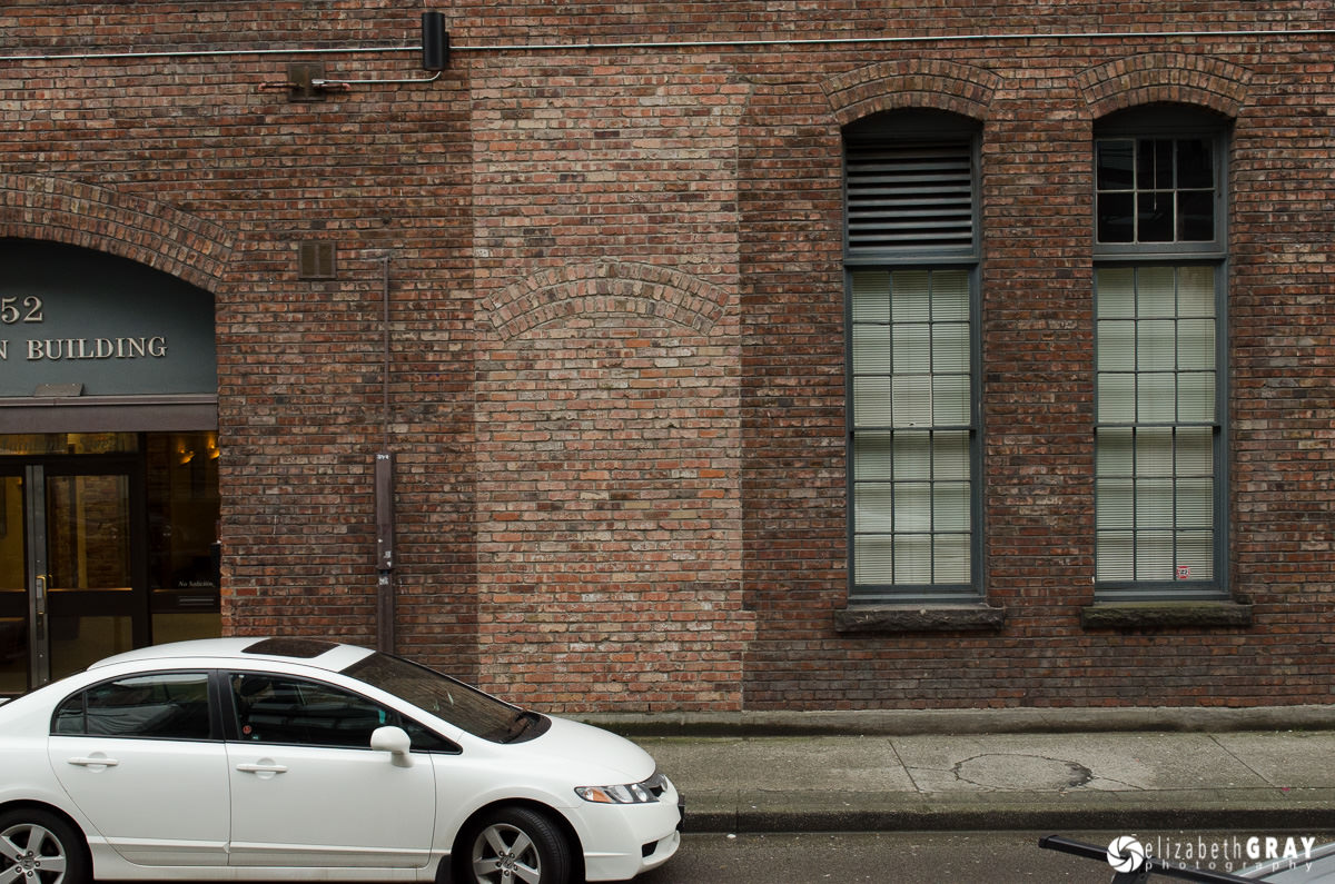
For this photo of an old window and brick wall, I had to stand across the street on a set of stairs so that I would be up high enough to look straight on at the wall. Had I stood at street level, I would have had to angle my camera upwards. The only way to stop keystoning in the field is to keep the back of the camera vertical.

NIKON D7000 + 24-70mm f/2.8 @ 64mm, ISO 1250, 1/40, f/8.0
This photograph gives you an idea of where I was standing to keep the wall from tilting back.

NIKON D7000 + 24-70mm f/2.8 @ 31mm, ISO 1250, 1/60, f/8.0
Sometimes it is impossible to shoot from a position that keeps the back of the camera vertical. For example, if you want to take a photo of a tall building, even with a very wide-angle lens you will have to angle the camera upwards. This occurred in the photo of the high-rise above. In situations like this you will have to correct the keystoning in post-processing. This is very easy to do in any program that offers perspective corrections, like Lightroom. In a future article I will discuss how to correct perspective in Lightroom. In the mean time however, if you can’t avoid tipping your camera upwards, give your subject lots of room. You will need to do some cropping after you correct the perspective in post. Here is the photo of the high-rise after I did a perspective correction in Lightroom. Notice how the final version had to be cropped quite substantially because I lost the bottom corners of the image when the perspective was corrected.

NIKON D7000 + 10-20mm f/4-5.6 @ 14mm, ISO 250, 1/15, f/16.0
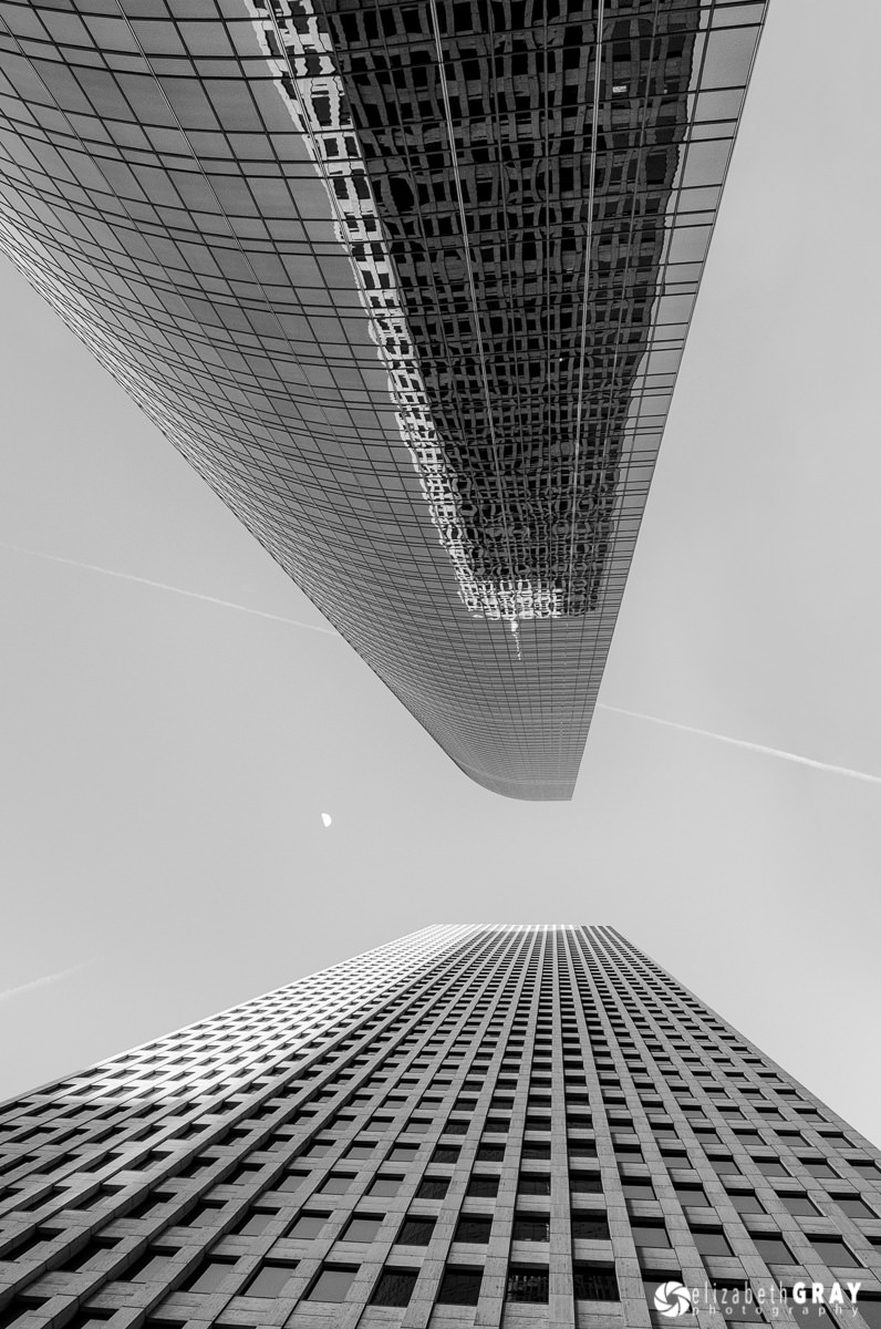
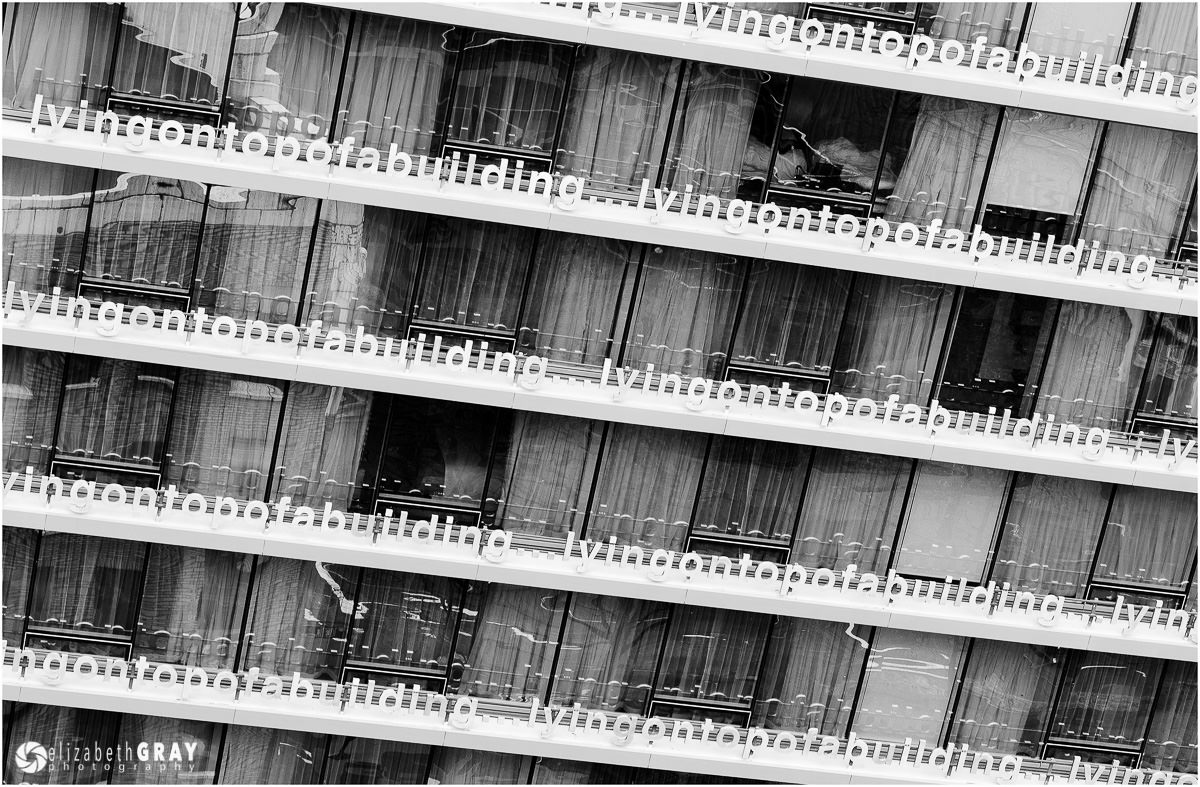
On the flip side, some very interesting photos can be taken by intentionally tilting verticals and horizontals. If you try this, do it with gusto! You want to make sure that the viewer is clear that your composition choice was intentional.

NIKON D7000 + 14-24mm f/2.8 @ 24mm, ISO 400, 1/50, f/11.0

NIKON D7000 + 10.5mm f/2.8 @ 10.5mm, ISO 200, 1/640, f/10.0

NIKON D7000 + 24-70mm f/2.8 @ 70mm, ISO 200, 1/13, f/9.0
2) Border Patrol
One of the most common distractions I see when critiquing photos are bits and pieces protruding into the edges of the frame. These distractions cause your eye to wander away from the main subject. Yes, you can “fix” them in post-processing by cropping or cloning, but why not deal with them at the source? These edge distractions often take the form of branches, bright spots, or a small bit of something that just clearly doesn’t belong in the photo. When you are framing an image, before you take the shot, look around the borders of your frame. Are there any distracting elements? If there are, adjust your composition just a bit. Usually a simple step to one side, or a slight change in camera angle can fix the problem before it is a problem! When I take a photo, besides checking the histogram for exposure, I quickly glance around the edge of my frame to make sure that I haven’t got any of those nasty little distractions that try to take the spotlight away from my subject.
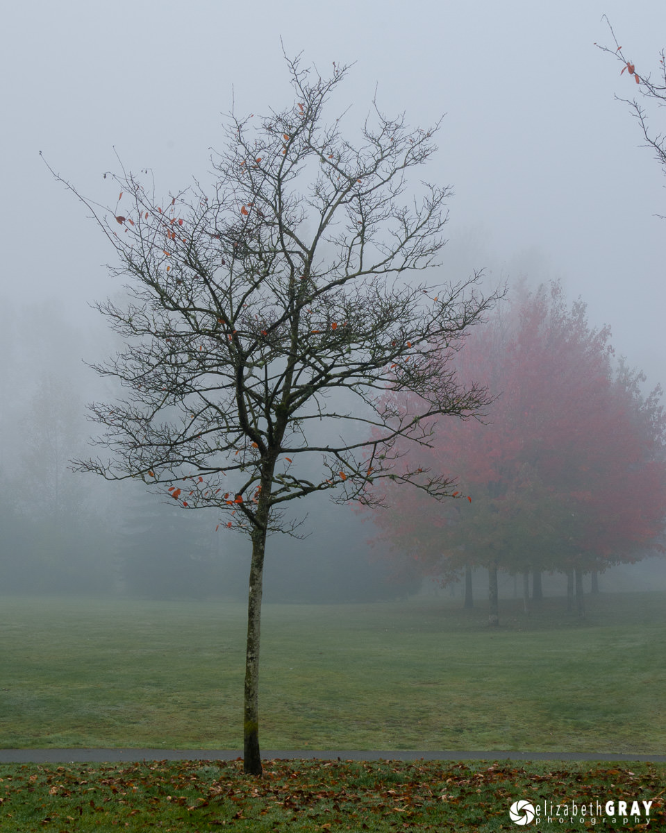
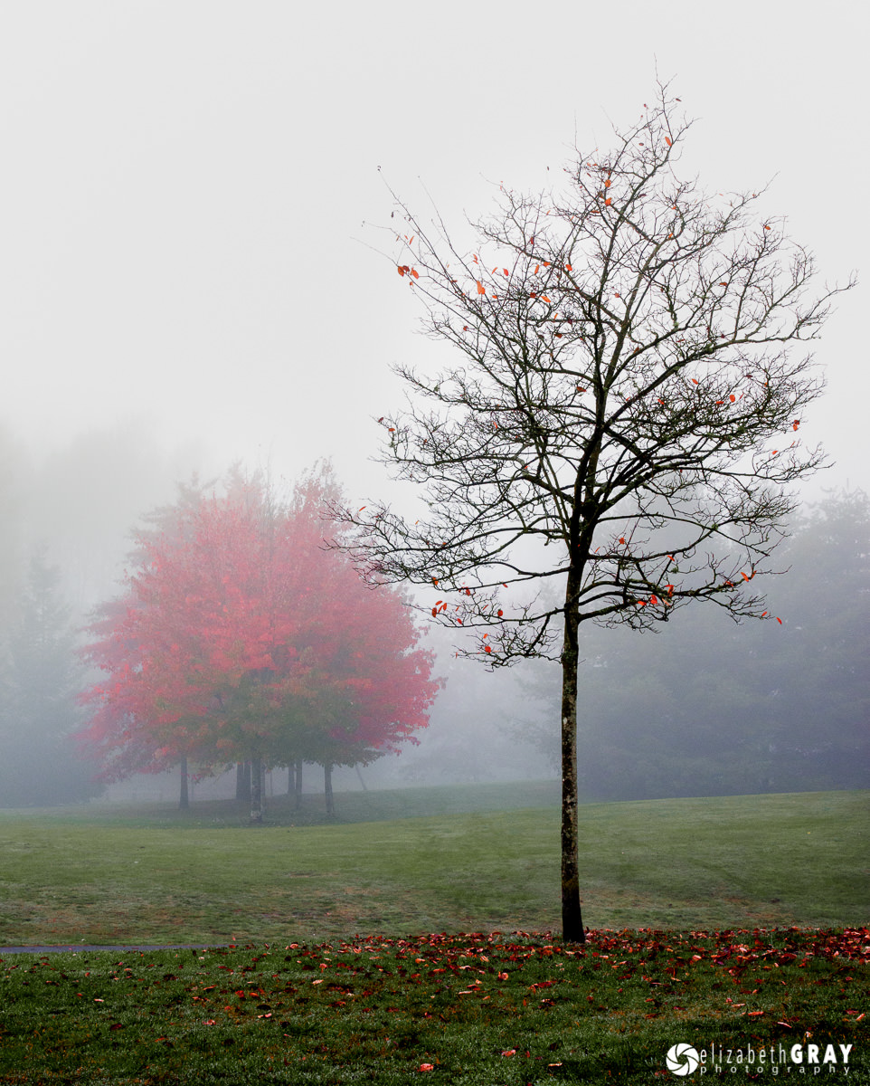
When I took this image I noticed the distracting branch at the upper right edge. If I tried to crop this in post, I would have lost some of the red tree in the background. By shifting to the left, I was able to remove the distracting branch. As an added bonus, I was now able to get the entire group of red trees in the background.

NIKON D7000 + 24-70mm f/2.8 @ 42mm, ISO 400, 1/4, f/11.0

NIKON D7000 + 24-70mm f/2.8 @ 34mm, ISO 400, 1/5, f/11.0
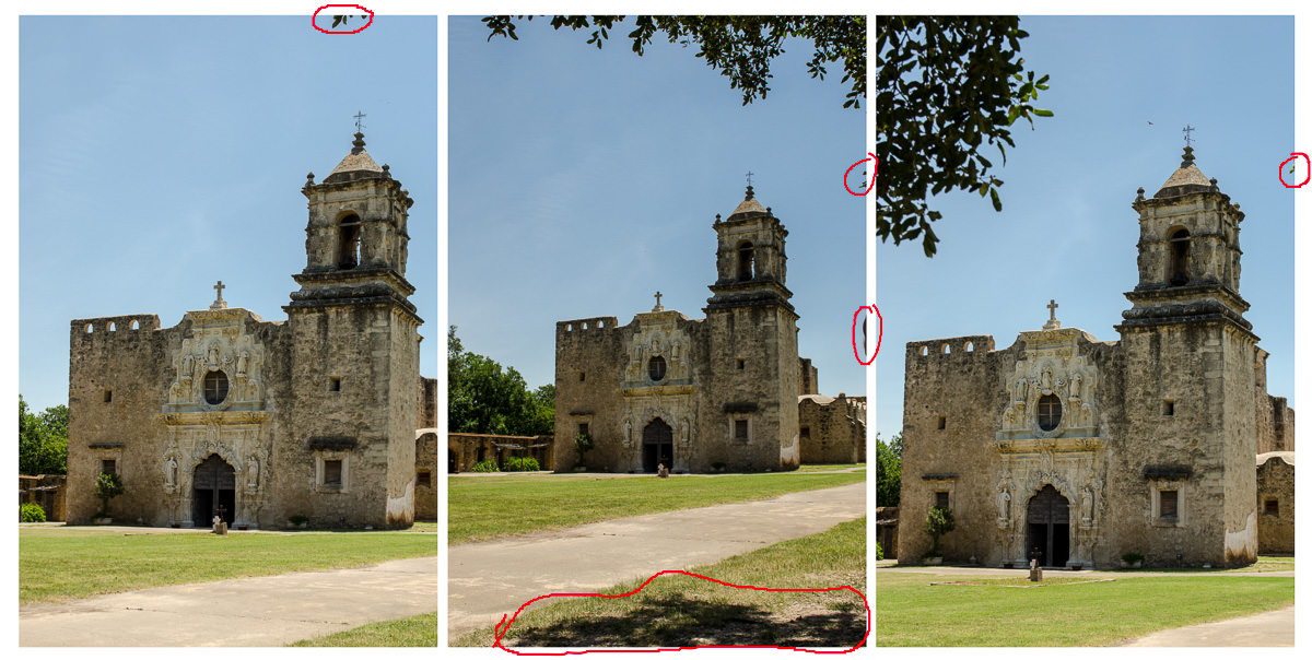
In these photos below, I tried several different perspectives. There is one annoying branch in the first photo. In the second, I tried unsuccessfully to frame the church using the tree. However, now I had a distracting shadow as well as two intruders along the right edge. The third attempt still had a small border distraction. And yes, I know how to use the clone tool and the spot healing brush in Photoshop! However, if I can get it right in-camera, it will save me a ton of post-processing time. These are all uncropped images.

NIKON D7000 + 24-70mm f/2.8 @ 38mm, ISO 200, 1/1000, f/6.3
Here is the final composition. The trees around the edge of the frame are intentional and help to frame the mission. My vantage point also eliminated the shadow on the ground. As a side note, the mission does display some slight keystoning, but this could be corrected in post.

NIKON D7000 + 24-70mm f/2.8 @ 26mm, ISO 200, 1/1000, f/6.3
3) Intersecting Objects
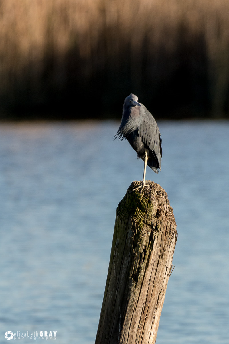
When two unrelated visual elements touch or overlap, they often draw unintended attention to their intersection. In this series of photos I was trying to capture a little blue heron on a piling. In the first picture you can see that his head is merging with the dark grasses across the bayou. By taking a few steps to the left and climbing a small incline, I was able to get a much better image.

NIKON D7100 + 200-500mm f/5.6 @ 500mm, ISO 400, 1/1250, f/6.3

NIKON D7100 + 200-500mm f/5.6 @ 500mm, ISO 400, 1/1000, f/7.1
Here is another frame from the windsurfer series. Here the kite and the horizon brush up against each other. I don’t feel this is as strong an image as the one at the top of this post where the kite cuts the horizon closer to its center. In that image, although two important elements of the frame intersect, they do so in a commanding way, and not half-hardidly.

NIKON D800 + 80-400mm f/4.5-5.6 @ 195mm, ISO 200, 1/3200, f/6.3
Sometimes it is not possible to change your vantage point. However, patience often pays off. Notice in this first image of several sandhill cranes in flight, that two of the birds’ wings are overlapping. Waiting just a few seconds, and keeping my fingers crossed, I captured an image where I can clearly see all the birds individually.

NIKON D800 + 200-400mm f/4 @ 550mm, ISO 400, 1/1600, f/8.0

NIKON D800 + 200-400mm f/4 @ 550mm, ISO 400, 1/1600, f/8.0
4) Simplifying
It is easy to have your subject become lost in a busy or cluttered image. Whenever possible, try composing so nothing competes with the subject. This can be done a couple of ways.
Try shooting the subject from different angles. Sometimes changing your perspective, even slightly can be the difference between a good photo and a great one. Here are two images of the same yellow lotus flower taken a few seconds apart. Although the background is nicely blurred in this shot, it is very busy. There are several highlights at the top right that distract the viewer from the bloom.

NIKON D7000 + 200-400mm f/4 @ 450mm, ISO 200, 1/200, f/11
For this photo, I positioned myself further to the right of the plant. This put the bloom in front of the water and not as much of the vegetation. The result was an image with all the focus on the flower and none on the background.

NIKON D7000 + 200-400mm f/4 @ 400mm, ISO 200, 1/640, f/5.6
Here is another example of how changing perspective can improve a picture. The top left corner of this first shot completely takes away from the branch and its beautiful fall foliage. There is even a telephone pole visible in the background. Near the top right corner is a bright white spot that also detracts from the subject.

NIKON D7000 + 200-400mm f/4 @ 220mm, ISO 800, 1/80, f/10.0
Moving to the left, and stepping a bit closer has created a much better image.

NIKON D7000 + 200-400mm f/4 @ 220mm, ISO 800, 1/50, f/10.0
Another way to simplify your composition is to clean up the scene before you take the picture. Pick up any litter. If there is a distracting object, temporarily move it! Just make sure that you put back everything before you leave, except the litter! That goes in the trashcan! I have a short length of string in my camera bag and some cloths pegs. I use them to gently pull back branches when I’m taking flower shots and macro images. If I’m in my own garden, I often do some “pruning” if I notice a wayward branch. Don’t try this at a public garden or park though, the string and cloths pegs will work great here.
In this shot, notice the piece of tape in the corner and my shadow. I know I could have fixed both of these using Photoshop. But I can guarantee you that it would take a hundred times longer than it did for me to bend down, pick up the trash, move so that my shadow was not in the frame and take a second image.

NIKON D7000 + 24-70mm f/2.8 @ 58mm, ISO 160, 1/125, f/11.0
Raw Image
This second image is much “cleaner” to look at!

NIKON D7000 + 24-70mm f/2.8 @ 58mm, ISO 160, 1/250, f/8.0
Processed in Lightroom
5) Conclusion
In the digital age of photography the majority of photographers press the shutter release quickly and frequently. After all, a digital image is free (minus the cost of the camera, lens, post processing software … well you know what I mean). However, what most photographers neglect to consider is the cost of their time. Going through hundreds or worse, thousands of images can be very time consuming. You will save yourself countless hours reviewing photos and correcting them in your favourite post-processing program if you slow down and think about your composition first. This doesn’t mean that you have to get it right with the first shot. But review your images after you take them. Ask yourself these questions before moving on to a new subject. Are my horizontals and verticals actually horizontal and vertical? Do I have any distracting bits and pieces poking into the borders of the frame? Do any of the main elements overlap or touch? And finally, is there anything I can do to clean up the composition? With these four questions addressed before you shoot at 10 frames a second, you will not only save valuable time, but you will end up with images that you are much happier with. This will give your brain time to linger and enjoy your artwork!
The post Four Simple Tips for Better Composition appeared first on Photography Life.
from Photography Life https://photographylife.com/four-simple-tips-for-better-composition